Book Lovers Inc.
Romance Novel Reviews, Author Interviews, Commentary
On Our Bookish Minds: Lets Talk About Book Covers
 The old saying of never judge a book by its cover is true most of the time. However, there have been instances when there is a bad cover or even those which do not illustrate the characters realistically, such as the recent controversy about the whitewashing of protagonists in several YA books.
Often these are still good books, just bad cover choices.

 I don’t usually let bad covers put me off to a book, but there are times for each of us I am sure it happens for better or worse. Beautiful covers can be misleading sometimes though and I have been burnt several times when I picked up a book that I thought would be good just because of the cover. It is much worse to find a book with a great cover but lacking great writing than it is to find a bad cover with great writing! It is in those situations where I chose a book by it’s great cover that I am reminded of how important other book bloggers are to me and wish I had read some reviews before handing over the cash for certain books. A good example of a beautiful cover and a book I wasn’t impressed with is Beyond the Pale by Savannah Russe. Even though I didn’t care for the book itself, there is no denying that she is blessed with an absolutely beautiful cover.

The cover of a book is incredibly important and it is becoming more and more imperative that covers be in someway attractive, as those precious first seconds can capture a new reader’s interest . This leads to what type of covers there are, especially how specific genres covers differ in different countries. I had an interesting conversation on Twitter the other day about how Urban Fantasy/Paranormals and Romance books are marketed and designed in different countries. To start off with a very clear example of the how different covers can be for different countries, fellow Book Lover, Susi showed us these three different covers of Michele Rowan’s book, Bitten & Smitten:


 It is really interesting how covers change in approach and tone, depending on the publisher’s country of origin. And it does highlight what kind of expectations and attitudes there are for different genres. For example; if we look at historical romance, the US covers tend to have a wide variety of styles and approaches. Galen Foley, for instance, has a stark contrast with her US/UK covers. Her covers in the US tend to range from the usual romantic clinches to shiny and subtle covers, but they do convey there is sexy action going on. However in the UK, the covers are subtler and have traditional romantic styled paintings which infers that this is romantic, but not as hot or sexy as the US covers imply. Moreover this gives the books a more classical literature feel and I really like this approach as it captures the feel of the time periods but gives the genre a more serious approach as well being inherently romantic in tone.
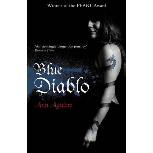
 The same goes for Urban Fantasy and Paranormal romances. Some great examples of the differences between covers/marketing styles for these genres in the US verses the UK are the following:
The US Covers are on the left and the UK covers on the right for all examples.


Nalini Singh’s US verses UK covers.


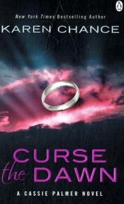 However the subtle approaches by the UK publishers can sometimes be too subtle and even abstract – good example is the cover for Curse the Dawn by Karen Chance which ironically enough shared the covers for the first couple of books with the US but decided to stick a ring in a dawn background. I later realized the silver ring was meant to refer to the group of mages in the book, but I think the original US cover had a better depiction of what the book was about.
As you can see from these examples, there is a huge difference in approaches to book covers, but that’s not to say they convey the wrong message about the book itself or aren’t as affective or attractive to the reader. But it does raise interesting questions about genre expectations and the pre-conceived notions surrounding them, such as sexuality.

 For example, romance covers in the UK are more subtle and it tends to be more focused on women’s fiction – such as chick lit – which usually has cartoony styled covers or historical/family sagas that depict steamy cliches or ‘bodice ripper’ covers tend to be present on Harlequin/Mills and Boons books in the UK to my knowledge. Other covers that are linked with strong romantic/romance overtones usually have abstract or subtle covers, which doesn’t emphasize that there might be a strong sexual content in the book. Of course there is cultural and language differences between different countries, but these examples somehow comments more about the publishers and people’s attitude towards sexuality and sensuality. To me this illustrates how genres associated with women are not regarded to be serious compared to other genres, which tend to have a more serious tone in their covers, and if there is sexual content, its suppressed or hidden in the cover.

I found this interesting because the emotional aspects such as love and sex is seen to be embarrassing and it is linked with titillation. This leads to the idea that sexy covers should be or are seen to be embarrassing and derided. Yet isn’t the main aim and point of romance is to have a healthy example of love and sex? Here in the UK, you have Page 3 girls from The Sun and other tabloid newspapers, who show their naked bazookas and a hint of more with your cornflakes and morning cuppa. The connotations coming from this can be seen as more unhealthy and objectionable than sexy covers with hot clinches and mantitty from a romance book. This points to the fact that genres aimed at women – which have sexual content – are seen to have less value than other forms of media which uses sex as a selling point. Yet it can be argued that the mantitty covers can be regarded the same way but the depictions in those covers are more idealized and romantic than the overt sexual overtones of other forms media which use sex as a selling point. Romance is a genre that emphasizes the emotional as well as the sexual elements in a story as something valued and positive. It’s also empowering to the reader and to the characters themselves.
I use to think that the hot covers were something to be embarrassed about, but now I don’t really care, if they have the traditional hot clinches or the subtle type, because I have come to realize that the mantitty/flyaway haired women with dresses and blouses half undone is part of the charm. Although they may not always reflect the content of the book, it’s part of romance’s identity, and maybe its partly because I’m use to these images from the marketing by US publishers. Suppressing this wont attract those who sneer at the genre because they already have made prejudgments on the genre. So lets embrace it like a hot alpha male!
If you’re interested in more book covers from around the world, then head on over to the on-going French book covers post (“The Good and The Bad!”) on our The HEA Lover’s personal book blog – One Book Away from Heaven. It is becoming a rather comprehensive list and she gives us a chance to see some book covers we don’t usually get to see.
Do you have some book covers you love or hate that you’d like to share? Tell us about them, we love book covers!

Share This Post
Subscribe and stay up-to-date


3 Comments
« Interview: Libby Cone, Author of Flesh and Grass Next Post
Bookish Rants or Raves: eBook Publishing Fail »


Unfortunately Google Friend Connect will stop working for non Blogger blogs at the start of March.
To stay up-to-date use one of the other options above to subscribe to the newest Book Lovers Inc. action.Thank you!


| 5 Stars: Perfect! I Love It! | |||||||||
| 4 Stars: Awesome Book! | |||||||||
| 3 Stars: I Liked It! | |||||||||
| 2 Stars: Not bad, but maybe not for me. | |||||||||
| 1 Star: Didn't like it! Did Not Finish it. | |||||||||


 Blog RSS Feed
 Follow Me on Twitter
 My Facebook
I love this post! I'm a huge fan of covers…Yes i'm a bit shallow when it comes to book cover but a book with an ugly cover will not appeal to me. I'll have to have it heavily recommended to me to get over the ugly cover.
I love how different countries have different taste in covers.
I sometimes love the UK covers better than the US one, but I usually get the US covers because they are the first published. German covers are often very good. And well as you could see in my post the French covers can either be amazing or plain ugly. They are making an effort with UF covers right now because the 'Bit-Lit' genre is becoming popular in France (Finally….)
Lol I love the last cover with the 'barbarian' look. I have a few of those books and i can tell you that it's harder to read a book when you are afraid you mom will see it lol (Yes i'm 24 and still hiding those) 😉
I think the cover of a book makes a big difference, it makes me want to buy the book as I know it will look great on my bookshelf at home.
I do like the characters on the front covers to match the descriptions in the books though, it's disappointing when they don't.
When i see covers and i havent seen the book before, if the cover doesnt stand out in some way-as well as the title- then im not likely to pick it up to read the blurb as much as another book that looks better. It might sound shallow when concerned with books, but if im gonna be spending huge bucks on a book i want it to be worth it. Though sometimes i do pick up the book and do like the blurb, its disappointing when more effort could be put in the cover. Its also quite amazing how different US vs. UK covers look like.