Book Lovers Inc.
Romance Novel Reviews, Author Interviews, Commentary
The Good, the Bad and the Are-You-Kidding-Me?
Filed in Book Covers , The Geeky Lover , The HEA Lover Posted on September 13, 2010 @ 2:40 pm
5 comments

Like we decided a dew weeks ago we will now choose our favorite covers in a genre for the next few editions of ”The Good, the Bad and the Are-You-Kidding-Me?” and tell you why we chose them. It would be awesome if you could tell us which cover in this genre is your favorite and perhaps we will all find some new to us cover candies we can obsess about.
This week we chose Historical romance covers for our fight…ahem..discussion. This week we chose Historical Romance covers because Caroline is addicted to those and I just started to discover this genre. *wink*
Susi’s picks:


Caroline: When Indiscreet came out last year, I kept seeing this cover everywhere. It was pure torture. I kept drooling over that man’s back. I love it. I don’t think I’ve seen a backside so tempting before. The only thing that didn’t really do it is the woman’s clothes. It doesn’t look ‘historical’ enough for me. Even the guy, at first look it’s not obvious that it’s a Historical romance. But that’s me being very demanding. All in all this cover is amazing. I think the pic of His at Night doesn’t do justice to the real cover. I’ve had it in my hands and it’s SO pretty. You can see more details of her clothing. I like it, if you’ve read Historicals before you can see the ‘wallflower’ theme here. It’s like he’s detaching her from the wall and bringing her to life. Very pretty cover. How I love the cover of Addicted! I just love it, it’s what brought me to read the book in the first place. I even can’t stop myself from looking for it in French in the stores here. I wish we didn’t see her face but otherwise I love it to pieces. It’s sensual and mysterious. AND I’m not ashamed to be seen reading it…which is saying a lot when it comes to erotica! lol
Susi: I think Indiscreet was the first real historical I ever read and yes shallow me bought it because I just love the cover. Okay yes I read reviews and really liked was I read but all in all the cover got me hooked. I love the color of her dress and the cut is wonderful. And his back is just made of hotness. Look at the way he kisses her shoulder. Much love! It’s a bit different with His at Night. I received that one as a review copy and when I held it in my hands for the first time I completely fell in love. The color is so rich and wonderful. I never thought I would say that about yellow but it just totally fits. And I agree about the wallpaper and how he turns the focus on her even though her dress has the same color as the background. It’s just pretty and yes even more gorgeous in real life. And the reason why I picked Addicted is that Caroline showed it to me when she first saw it and I was enthralled. Yes I still haven’t read it but I really love it. I like how the red and white are put into contrast. I also love the black background and this cover is so unusual for a historical. Just stunning. And why don’t you like to see her face?
Caroline: Yeah I love her dress too on the Indiscreet cover but it doesn’t shout ‘Historicals’ to me! That’s my only problem with it. And be careful hon, I LOVE the color Yellow LOL I don’t know why but her face doesn’t go with the rest of the cover. Somehow her face doesn’t ‘match’. But that’s just crazy me talking. =P
Susi: I really don’t know much about historicals so I wouldn’t spot a wrong dress even if my life depended on it. 😉 And about the face: just LOL
Caroline’s picks:


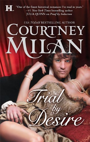
Caroline: When I started thinking about my favorite historical romance covers, i thought it’d be easy. I LOVE Historical romances. But looking at my shelves, I realized that most of my favorite books are fugly or plain covers. (a bit like with the PNR genre) Only a few books stand out for me. I was tempted to put both Addicted and Sinful in my selection because I love both. The cover of Sinful is SO gorgeous. Once again the pic doesn’t do it justice. I keep petting this cover. Matthew’s backside is just NOM NOM NOM. *threatening to hurt anyone disagreeing* lol And look at that ass! *roar*. Rakes & Radishes grew on me. Seriously at first I didn’t find it exceptional, very pretty but that was all. Now I really love it. I find the couple pretty sexy and their clothes are gorgeous. OMG look at Kesseley, he is so tempting! And that landscape sets it apart from other historical covers. Two thumbs-up for that cover. Trial by Desire is really sensual, erotic. I love the woman’s pose, her clothes and the pearls. The pearls on her neck…so pretty. I love her helplessness. The best part of that cover is the man, Ned. He is looking right at you, telling you all his secrets. I find it very sexy. The red makes it very sensual.
Susi: Okay perhaps it is because I have never seen the Sinful cover in real life but I don’t like it. *hides behind her chair* The guy is not for me and I will happily give him to you. LOL And I would like the ass more if it would be naked or at least in some boxer briefs. LOL I don’t like the color as much as in Sinful but perhaps it’s better in real. *shrugs* But I really like the Rakes & Radishes cover. The color of her dress is awesome and fits my new ereader. *huge grin* Totally besides the point but I’m still in pre-ereader-buying-bliss. Sorry about that. I like the way they turn to each other and that guy is what I cal SEXY. *rawr* I’m a bit torn about Trial by Desire. I love the pose of the woman. I agree about everything you said. She looks gorgeous and just wow. The guy is wow. I really really like him BUT he has a strange look on his face. It seems to be like taking a picture from BF, he can’t look perfect on a photo even if everything depends on it. I’m not sure if that guy should be a model. He’s pretty (I know men hate to hear that but guys seriously you should learn to take a compliment) and all but that posing is weird. Or perhaps it’s just me.LOL
Caroline: O_O *hunt Susi behind her chair with scissors* LOL ok…if could leave me Matthew I can live with that 😉 You perv LOL. Bwhahaha now that you are a proud ereader owner you’ll try to match everything to it LOL (have you named it yet? Is it female? coz i’m all for breeding it with mine. Which is named Trent Clayton Barrons FYI LOL)
Susi: No name so far but not sure if I can find a female name. Perhaps Cat cuz the netbook is Bones? We will see…LOL
Caroline: lol M/M ereader action is nice too LOL *looks out for the guys in white to come take her*LMAO
Susi: And it’s a violet reader. Not sure if I can associate a male name with that. O_o
As always we’d like to know if you agree with us.
What do you prefer- headless or gove me a face?
Which are your fave Historical covers?


Share This Post
Subscribe and stay up-to-date


5 Comments
Join the Discussion
Previous Post
« Review: Trial by Desire by Courtney Milan Next Post
Interview Author Stephanie Julian »
« Review: Trial by Desire by Courtney Milan Next Post
Interview Author Stephanie Julian »
Our Sponsors

Our Giveaways


Unfortunately Google Friend Connect will stop working for non Blogger blogs at the start of March.
To stay up-to-date use one of the other options above to subscribe to the newest Book Lovers Inc. action.Thank you!


| 5 Stars: Perfect! I Love It! | |||||||||
| 4 Stars: Awesome Book! | |||||||||
| 3 Stars: I Liked It! | |||||||||
| 2 Stars: Not bad, but maybe not for me. | |||||||||
| 1 Star: Didn't like it! Did Not Finish it. | |||||||||


 Blog RSS Feed
 Follow Me on Twitter
 My Facebook
I want heads, never did like those cut off heads, or half heads.
Loving the Thomas one, it's so yellow and pretty
I agree – the cover for Addicted is absolutely gorgeous.
And I need heads. The half cut-off heads just take me back to my Intro to Gender Studies classes about how advertisers dehumanize women by cutting off parts of their bodies.
I only like tattoos on covers when they MATCH what the characters in the book are supposed to have! I absolutely hate gratuitous tramp stamps….particularly when said lady has a specifically described tattoo. How would people have reacted if the Harry Potter covers gave Harry some extra scars, and nixed the lightning bolt, because they thought it made him more marketable?
I don't mind the partially hidden face because I like to imagine my own characters. I do like the man back trend though, very sexy!
'Addicted' & 'Sinful'… both covers are so pretty!
@Blodeuedd I agree! The yellow on the cover looks so pretty (me love Yellow *g*) . I do like cut off heads…it leaved room for imagination
@draconismoi I know cut-off heads can make them look dehumanized but I'd rather no heads than a face that I won't like. I need to LOVE the character and if the face disgust me I'll have a hard time reading the book and liking it. I knowwwwwww I'm shallow
OMG Lol it would have been ridiculous to have HP with more scars. I agree that it should match the character. The tattoos I love the most are those on the Patricia Briggs books…they don't match the characters but match EACH book content. LOVE those tats.
@Scorpio M. Yes I'm right there with you with the that fact that it leaves more room for imagination. =)
I can't have enough of Addicted and Sinful!! I also love the fact that for once I can proudly display my Eroticas without turning bright red 😉
I agree with Scorpio that the missing heads just let me imagine what the characters look like. Besides, I really try not to look too closely at the faces on the cover. Usually, whoever they chose for the woman is fine, but the man can be a deal breaker.
Of course, if every book has Paul Marron or Nathan Kamp on it, I'll be very, very happy. 🙂