Book Lovers Inc.
Romance Novel Reviews, Author Interviews, Commentary
The Good, the Bad and the Are-You-Kidding-Me?
Filed in Book Covers , The Geeky Lover , The HEA Lover Posted on February 14, 2011 @ 3:00 pm
26 comments

This week, we’re taking you to Germany and its covers. After our deep view into the french way today you are introduced to the Lederhosen and Bretzel way of book covers (and yes I can make prejudiced fun of it). As every other country we have the good and the bad and here are some of them. Let us know what you think about them.


Susi: I really like the German cover of Shades of Gray BUT I like the first one more. Why? First this one is blue and I’m not very fond of this color and second why is there a blue woman on the cover? I don’t get it. But yes it’S pretty and I’m sure I will find a reason to buy it for someone. LOL
Look at the wonderful cover of Mockingjay. I haven’t read these books *ducks away from the thrown tomatos* but I love this cover.The colors are so wonderful warm and I love the font They used for the title. I really adore the way the N spans out around the word Panem. Just pretty.
Every time I look at this cover Linda Robertson I’m reminded of the Signs of the Zodiac series by Vicki Pettersson even though those covers never were that colorful or light. I really like the cover but I’m not so happy about Seph’s pose- she looks a bit bored to me.
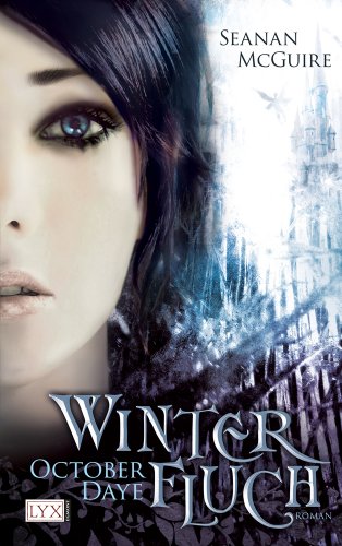
I haven’t read these October Daye novels but this cover caught my eye ASAP. I actually like the cold feel of it- it looks pecious and fragile to me. Something you shouldn’t touch cuz your afraid to taint it. Not sure if that fits the book at all. And on a side-note the cover model reminds me of Christina Stürmer an Austrian singer. LOL
Caroline: I have to say I found the Shades of Gray cover gorgeous. It’s vibrant and mysterious. Of course, I haven’t read this series so I’m not sure if it represents the book well. I think what I love is that it has a comic book feel. It reminds me of Watchmen.
Oh my, Susi you really should read the Hunger Games series, it’s really good. I really like this cover but somehow I think the cover model should look more fierce. She looks so soft and when you read the book you know that the heroine has been through so much she can’t look so tamed. It’s a pretty cover though and maybe I’m extrapolating too much.
I have the same ‘problem’ with the Linda Robertson cover. Each time I think of the Zodiac series. I don’t like this cover, the model looks ‘fake’ and It doesn’t fit the story. And really…the main problem is that I associate this cover to the Zodiac series. it’s disturbing.
I find the Rosemary & Rue cover very pretty and intriguing. But again, I haven’t read the series so I have no idea if it fits. What I can say is that I wasn’t attracted by the original cover because it looked so dark and gloomy. I think I could be fooled by the German cover, this one would make me read the book. Very pretty and like you said she looks pure and calm.


Caroline: Well, let me start with a WTF happened in this cover??? I know you’ll think i’m weird but all I can see in this cover is horses smelling each other’s butts. I told you, you’d think i’m weird. Anyway, there’s nothing RIGHT with this cover, it looks like a 80’s cover. And most of all, let’s address the elephant in the room…the colors. WTF, the ground is PINK??? It looks like any pic of me after I spent too much time using Photoshop. lol
The Katie MacAlister cover has some good and some bad parts. I think it could have worked with a different face or no face at all. I like that it looks very Steampunk and her clothes are badass! I just really don’t like the face part.
The Richelle Mead cover is MEH (I hadn’t used it yet today lol). It’s bland, it’s nothing interesting. The Half-face is irritating. I can’t say that the original covers are any better though. MEH!
The Chloe Neill cover is pretty yes, but it doesn’t suit the book at all. When I look at it, I think ‘asia’. The woman looks soft and the lights all point at to softness too. Does that make you think about badass vampires??? Seriously? No it really doesn’t fit the series. But as a cover it’s pretty.
Susi: LMAO horses???? I love you hon! When I look at this the first thing I thought was who let the paint fall on it? Seriously, did someone accidentally hit the “let the contrast explode” button? It’s so clichée and I would never buy that. NEVER in a thousand years- no matter how good the book is.
The German Steamed cover is bad. What happened to her face? Does some try to imitate Picasso? The background is nice though. But the woman looks scary.
The Last Sacrifice cover looks like a bad soup opera cover. every time I look at it it reminds me of those shows with the bad plot and the shitty filming. No idea why but perhaps she isn’t photoshopped enough-she looks too real and yeah it is sad but not appealing to me.
The Chloe Neill cover is so saying nothing- it looks so timid and for me it represents something like a light lovestory, set in a warm paradise like setting- sweet and nothing deep. What does that have to do with Chicago Vampires? I have no idea what this cover should tell us about this books being set in Chicago? I think it missed the point. But still pretty even though it doesn’t fit the genre.
Caroline: Hey don’t tell me you don’t see the horses like you didn’t see the Glasses on the Megan Hart cover! LOL
Susi: I just saw the sniffing after you said so LOL. Was distracted by all the pink. And there aren’t NO GLASSES!!!!!
Caroline: Right *wink* if you SAY so *g*
Susi’s
Favorite: The Mockingjay cover
Worst: the Tereasa Medeiro’s one
Caroline’s
Favorite: Shades of Gray
Worst: The Teresa Medeiro cover
Do you agree with us about these covers? thoughts?
Which is your favorite and which is the worst in your opinion? Tell us why!
Is there a new foreign cover you would have loved to be the original? If so, which?


Share This Post
Subscribe and stay up-to-date


26 Comments
Join the Discussion
Previous Post
« Interview: Author Christina Phillips + Giveaway Next Post
Interview: Author Katie Reus + Giveaway! »
« Interview: Author Christina Phillips + Giveaway Next Post
Interview: Author Katie Reus + Giveaway! »
Our Sponsors

Our Giveaways


Unfortunately Google Friend Connect will stop working for non Blogger blogs at the start of March.
To stay up-to-date use one of the other options above to subscribe to the newest Book Lovers Inc. action.Thank you!


| 5 Stars: Perfect! I Love It! | |||||||||
| 4 Stars: Awesome Book! | |||||||||
| 3 Stars: I Liked It! | |||||||||
| 2 Stars: Not bad, but maybe not for me. | |||||||||
| 1 Star: Didn't like it! Did Not Finish it. | |||||||||


 Blog RSS Feed
 Follow Me on Twitter
 My Facebook
oh my goodness, that Mockingjay cover is beautiful.
OMG! I snorted about the horse comment, I agree that is an ugly cover wow the colors are too busy.
Lol, I honestly did think that was an 80s cover…pink ground! OMG
@Alicia I completely agree =)
@BLHmistress said Isn't Caro priceless? That's why I love her so much! And yes eyebleach needed after looking at that cover for too long! =P
@Blodeuedd Perhaps they tried to go for the good ol'times =P
@AliciaNicole It really is. Maybe too pretty for the book though.
@BLHmistress Teehee so am I the only one who was distracted by the butt sniffing? .LOL it's ugly all the way!
@Blodeuedd I would have thought it an old cover too. Impressive they still make those O_o lol
@Susi there Were glasses on the cover!
Butt sniffing horses. LOL. and I do agree that it is really bad. 😐 It looks like a classic romance novel.
@Greyz Some classic romance novels cover aren't THAT bad. At least they are pretty, if only very cliché…but this one is a total fail.
I think the butt sniffing horses are the final touch *g*
@GREYZ Classic with a blast of color LOL
The Mockingjay cover isn't bad, but it's just not doing it for me. There has been so many YA covers lately with close ups of girls' faces that it's all starting to blur together. This is such a great series and it deserves a cover that's more distinctive.
The covers for Rosemary and Rue and the Chicagoland Vampires are also nice but neither one fits with the story. The October Daye series is dark and gritty, while the cover model is all pretty and flawless – not a good fit. (But don't let that stop you from reading it! It's a great book!) And I agree with what both of you said about the Chloe Neill cover.
@les121 Yes I agree. It seems some publishers have a problem with fitting the cover to the book and not only the genre. It really annoys me that it sometimes seems as if they haven't even looked at the book description. This leaves too much room for missunderstandings and yes some books really would deserve a more distinctive cover.
LOL! I'm not looking at the horses on the cover just the colors! I'm not sure why they chose that color scheme. It looks like an acid trip come to life. Epic fail.
Stacie
GeishasMom73 on twitter
@Les121 I know that I would be angry to be mislead by a cover. I always check out the book I like on Goodreads/Amazon/other blogs…getting books online helps making a lot. But not everybody does :/
@GeishasMom73 Ah indeed! It's exactly what it looks like. lol I still don't get the pink floor O_o I don't know what they smoked but they should ease on it a little.
@Stacie Acid Trip!! That's it! LMAO
Hey!
I really like the cover of the October Daye book.:D I like the covers of Shades of Gray, Mockingjay (which is way better than my Romanian cover!) and of that Linda Robertson book – even though I don't think it fits the book (like you said, it makes me think of the Zodiac series). And the others are just… let's say OK. Oh, and I like that cover for the Chicagoland Vampires better than the UK one (even though it doesn't really represent the book LOL) 😀
Anyway… best cover: Rosemary & Rue, worst… Teresa Medeiros whatever. Way too 80's and colorful for me! (just my opinion)
xoxo
The first batch are pretty good, but the Katie one freaks me out! LOL. I think the girl looks weird….
Poor Teresa! What did she do to deserve that cover?
All the ones in Susi's group look good, with Mockingjay (which I also haven't read) as the best.
I think Caro is just having fun with us all on this Valentine's Day. Pink dirt, indeed!
@Deea I can't remember if i've seen the romanian cover of Mockingjay *thinks* I think I'll have to investigate.
AH indeed!! The UK covers Chicagoland series suck!!!
@Chelsea B. The girl on the Katie cover is pretty scary. Even more when you look at it in big. Scary!
@LSUReader I have to defend my honor and tell you that SUSI chose ALL the covers! lol I'm not responsible for the covers! LOL
*narrows eyes* now I'm starting to think she did that on purpose! =P
@Deea Now I want to see the Roamnian one. LOL
@LSUReader LOL muahahha I tricked you! Yes those are all Caro's favorite covers. Bwahahahha!
Hey guys!
Here is the Romanian cover I was talking about… so you get my idea. Ugh
@Deea Thank you for posting that cover. Oh my, it's very ugly. Her face is EWWWW. This cover is really really not appealing
@Deea Absolutely one of teh Are-You_kidding_me? So bad.
Girls I'm always in awe of all the horrendous and beautiful covers you manage to dig up 😀
Oh my that Teresa Medeiros cover seriously hurt my eyes! What's with the flashy colours? Looks like a '80s neon party romance, ugh (and Caro I don't know about the glasses, but I'm with you on the horses' butt sniffing, weird!)
But I don't agree with you regarding the Mockingjay cover: in my opinion the heroine looks fierce enough, maybe because of the bright green eyes. Love the N Susi!
Thanks for another hilarious post Ladies! 😀
@Stella Wooot I'm glad to see I'm not crazy and the horse butt sniffing looks weird LOL =P
hum I'm still not sure about the Collins book. I always pictured her more…well yeah more fierce. But the cover is growing on me the more i look at it.
Now I just need to get Susi to read The Hunger Games (if you think you can sell her a YA book, you are a HERO lol)
Reading books more often in the English version than in German translation I must say that I sometimes like the original US or UK covers better, than I prefer the covers of the German editions.
What I always found odd is that there actually ARE different covers for the same books in different countries and I was literally stunned when I saw that "Matched" has got almost (more of a close-up of the original) the same one in the US and Germany! That's pretty unusual.
I love the covers for Mockingjay, October Daye and Chicago Vampires. I don't know if they fit the books but they are really pretty and would definitely catch my eye in a bookshop.
The covers for Shades of Gray, Persephone Alcmedi book and Steamed all seem like almost great covers, but each one has something a little off about it.
The Richelle Mead book is just boring, and the Teresa Medeiro cover, well I don't think I have words to describe how bad I think that cover is.