Book Lovers Inc.
Romance Novel Reviews, Author Interviews, Commentary
The Good, the Bad and the Are-You-Kidding-Me?


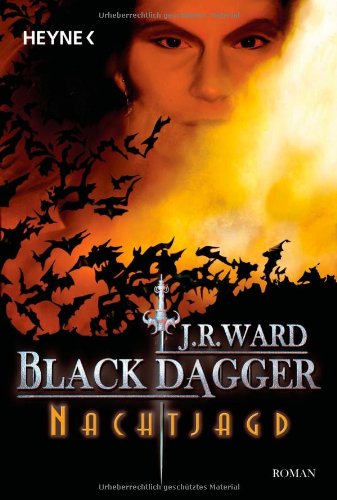
Caro:
Us: I like it but don’t love it. It’s a bit bland but not bad.
Finland: Is she a bat or something? A crazy bat since she looks to have a straight jacket on (a goth version of it though). 😉
UK:I LOVE this cover. It’s pretty and sensual. I love their pose and how they seem to make one. <3
German: Beware the bad breath of Wrath. Yes that guy blow fire/bad breath on bats to make them leave his crops. Apart form that, his face looks gummy and fake. And his eyebrows are O_O Big no-no!
Susi:
Us: It’s okay but too nothing saying.
Finland: I don’t get why she hangs upside down.
UK: I don’t like the model- not like I pictured Beth.
German: I don’t like it. His eyes look weird but not like they should look.


Caro:
Norway: What are we supposed to see exactly? o_O I can see her neck, is it? I see a hand. But it doesn’t make much sense to me. o_O 2 *scratches head*
France: Not my favorite but i’ve seen worse. It’s just a bit too generic for me but not bad.
Portugal: I’ve seen this stock photo on a blog but can’t remember where and it’s driving me crazy. Anyway, I don’t like it much. She looks too fierce to be Beth. And the font is too flowery. It’s just meh.
Hachette Digital:That guy looks familiar.Makes me think on an actor but who? Not a bad cover, I like it.
Susi:
Norway: Another confusing cover. I like the look but no idea what it shows and it doesn’t really fit the book.
France: Yep, generic and is that the same stockfoto as on the Moira Rogers/Lauren Dane cover?
Portugal: I like this one but again not fitting the story.
Hachette Digital: I agree sweety- looks like someone I know but can’t place his face.


Susi:
Italy: That looks like a creepy YA cover and no idea why they chose it for this book.
Bulgary: Huh, looks weird and too stylized.
Czech: What is that on the left? Is it water attacking her throat? O_o
Poland: Seeing this cover I would say detective uf novel. So nope, doesn’t work for me either.
Caroline:
Italy: CREEPY!! Zombie Vampire YA! Ewwww
Bulgary: Yeah too photophopped and the man is on the cover of another famous book. Meh
Czech: LMAO indeed she’s been attacked by water! It could have been ok without the water and without the read on the top and bottom.
Poland: Indeed it looks like detective UF. It would be a good cover…just not for this series.


Susi:
Indonesia: Ah WTF? O_o That guy is creepy and OMG so not Wrath.
Portugal: Even worse than the US one. Too blurry and not enough contrast.
Japan: I like it even though the heroine looks wrong. The arangement of everything is awesome.
Audibook: O_o I hate the colors and it looks so dreamy and all.
Caro:
Indonesia: I’m not sure what to think of the guy on the cover. o_O is that a perm? It’s not bad…but …a bit weird LOL. At least he has long hair and black glasses. *shrug*
Portugal: It looks like it’s been washed too many times. You can hardly see the models. Meh MEH!
Japan: Indeed the heroine is all wrong but the cover is very pretty. The red is warm and i really like the pose. 2 thumbs up.
Audibook: Dildo Dildo! (aka Ditto ditto). Is Beth blond? o_O I don’t like it.
Caroline:
My favs: Japan and UK
the worst: Italian and German
Susi:
My Fave: The Japan edition
the worst: Hands down the Indonesian cover.


Share This Post
Subscribe and stay up-to-date


11 Comments
« Review: Seduction & Scandal by Charlotte Featherstone Next Post
Interview with Vivian Arend + Giveaway »


Unfortunately Google Friend Connect will stop working for non Blogger blogs at the start of March.
To stay up-to-date use one of the other options above to subscribe to the newest Book Lovers Inc. action.Thank you!


| 5 Stars: Perfect! I Love It! | |||||||||
| 4 Stars: Awesome Book! | |||||||||
| 3 Stars: I Liked It! | |||||||||
| 2 Stars: Not bad, but maybe not for me. | |||||||||
| 1 Star: Didn't like it! Did Not Finish it. | |||||||||


 Blog RSS Feed
 Follow Me on Twitter
 My Facebook
I do like the Portuguese, but I have seen it around. And haha, oh the Finnish one cracked me up the first time I saw it
Oh oh, Anna from Annas's book blog used to have it as her header..or was it VFG..hm
I agree though used to the US cover it is a bit bland, and wow the Italian is so strange I don't think I would pick it up if our cover was like that.
I am with Caroline, the UK and Japanese ones are the best. The UK one is dark but sexy and the color is fitting. The Japanese one is the same, I like that they used such a blood red color. It is a vampire book after all.
Worst ones are Italian and Indonesian. The Italian one doesn't even seem to fit the book. If I saw that cover, the first thing I would have thought was Zombie YA book. She looks like she just turned 14. What were they thinking? The Indonesian looks like something from an early 90s action flick that would have starred Jean-Claude Van Damme LOL! Don't understand that one either.
*Edited: Needed to fix a sentence LOL!
Japan is definitely the best cover….though there is a part of me that is partial to Finland just for being so out-there.
I'd definitely pick up a book with that cover in the store. Though I would expect it to be about an institutionalized bat lady.
cass at feministdracona dot net
@Bloduedd Yes it looks like a header.
@BLHmistress Yes strange is fitting.
@Offbeat Vagabond Looks like zombies indeed and the Indonesian one looks like a bad 90s action flick. LOL
@draconismoi Yes, that bat lady book could be interesting. LOL
I guess I just got used to the American covers. Of course, I absolutely adored the LOVER AVENGED cover (because of Paul Marron) and LOVER MINE (hard to beat a yummy male chest.
@Blodeuedd Yes the Finnish cover is funny. At least it's interesting.
And ahhhhh it might be VFG! It does ring a bell
@BLHmistress I wouldn't pick the Italian cover either. It's a bit scary.
@Offbeat Vagabond Bwahaahaha yes indeed it could very well be Jean Claude Van Damme, very fitting LOL
I'm glad to see we agree on the weirdness of the Italian cover.
@Draconismoi LOL Finland has been very daring with this one. It's not ugly at all, just weird. I just don't like covers that make me want to turn my head upside down LOL
@Sheree Have you seen the cover of Lover Reborn? It's O_O
@Sheree The Lover Mine cover is my absolute fave. So sexy. *g*
I'm not sure about LOVER REBORN. Yes, he looks intense enough for Tohrment but there's just something about that orange-y color I don't like so much.
I'm from Indonesia *hang head in a shame*
And, I really2 hate that Dark Lover cover *sobs*.. So , I'm not surprised when Caro and Susi said its the worst, lol! 😀
Honestly, I'm angry, shocked, embarrassed and mortified. I complaint to the publisher, and they said, it because the editor "think she know what Wrath look alike". When I know about that, I planning to murder the editor, LMAO!! Some people said don't judge the book by its cover, but hey, they never read BDB before. I read BDB in original version first so I know this series is great.
That Indonesian cover? It ruined anything 🙁