Book Lovers Inc.
Romance Novel Reviews, Author Interviews, Commentary
The Good, the Bad and the Are-You-Kidding-Me?
Filed in Book Covers , The Geeky Lover , The HEA Lover Posted on September 12, 2011 @ 2:00 pm
10 comments

Wilkommen, Bienvenue, Welcome*! This week we decided to stick to our color theme. And with what? Well the best color ever! RED! (⇐ Susi and Caro for once agree on something). It shouldn’t be a surprise that many covers in the romance genre use this color. Well it stands for passion and love (and some other things we will just ignore right now). So it was actually easy to find some covers we adore. So here is our selection. Be sure to tell us what you think.
*(I don’t know for other European countries, but France is plagued by a new ad for a train. Sadly it’s an earworm.)
Caro’s choice:


Caro: I first fell for the cover or Ravishing in Red then I fell for the book. I like this cover a lot. The dress is pretty without being extraordinary. I love how she’s posing. I love how her hair is done. My only complaint is that the title and author names are way too big and they are hiding the pretty cover.
The cover of Warrior is just AWESOME! It’s wow. I completely fell in love with this cover from the first look. Yummy yummy Indiana Jones-like model. I love how his face is in the shadows. I’d marry this cover if I could.
I haven’t read Sister Red but I really like this cover. The design is inventive and original. I really love. <3 <3
Susi: Well the first cover is okay but nothing really eyecatching. I’m not even sure if I remeber seeing this cover ever before and I’m 100% sure I did. I like the color though. (snort- we will how often I can say that today *wink*) I completely agree about the Warrior cover. it looks adventurous and makes me wanna explore it in all its details. As you said the Sisters Red cover is pretty unique. I like the design and how it has this Art Déco feel. I like it when the cover artists take a risk in trying something new- and this one definitely sticks out of the mass.


Caro: The Outlaw Demon Wails is a cover that grew on me. My first thought when I saw it was O_O What is this outfit? . But it’s not as bad as some of the other outfits they gave Rachel throughout all the book covers. I love how badass she looks and I love that we DON’T SEE HER FACE! Ah! Yes Caps-lock attack. I love the colors and I love how the light makes is mysterious and eerie. Now the author name could be downsized a little, no need to poke me in the eyes Miss and Mister publishers…I know who the author is! Shadowfae is pretty! I love the swirly pattern around the title. I also love how sensual that woman looks. This covers screams ‘erotica’ to me. I wasn’t sold by the book but the cover sure is pretty. Seduce me at Sunrise is one of my favorite. That read dress is simple but It calls me! Much like the cover of Ravishing in Red. My only complaint is the (yes again) huge author name. I keep staring at this cover, I really like how she put her hand on her throat, it’s a simple pose but I love how it looks so natural. 2 thumbs up.
Susi: I don’t like the…what’s the author name again? (bwahahah couldn’t resist) cover. The outfit sucks- makes her legs seem huge and well IMO leather shouldn’t be worn in such abundance. The background looks weird too and perhaps it’s cuz I just rewatch Stargate Atlantis but it reminds me of a Wraith ship. *shrug* I like the Shadowfae cover in parts- the title and the swirly background are great but I don’t like the pose and outfit of the cover model. It looks too slutty and well yes perhaps the heroine might be like that (I have no idea cuz I haven’t read the book) but I still don’t like to look at it. I agree about the post on the Kleypas cover- looks really good but I think the fan steals a bit of the focus. It’s distracting my eyes and without it the pretty dress and pose would come out more. And well yes they often overdo themselves with the HUGE names. *sigh*
Caro: The heroine of Shafowfae is a succubus (If i remember right) so slutty works LOL
Susi’s choice:


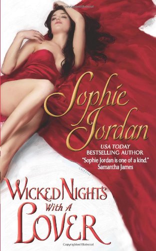
Caro: I’ still unsure about Megan Hart’s cover. I like a lot of things about it but something is off, maybe it’s the yellow title. The contrast between the red and her skin is delicious though. I like the H font. It rocks! The Girl in the Steel Corset is just gorgeous. This is so beautiful, so amazing. I love red satin is just wow. I have nothing bad to say about it. But I’m afraid this book suffered from the Fantastic-book-cover-buzz . It’s hard to live-up to such a gorgeous cover. Sophie Jordan’s cover is nice. It’s not exceptional though, by that I mean that it looks like many historical romance covers. But it’s a nice cover. I like the red fabric on white skin. It’s sensual.
Susi: I really like the Selfish is the Heart cover. As you said her skin tone is great- it looks slightly flushed and it’s up to our imagination why and I love the font they used. And I love that the woman looks real. You know she doesn’t look so fake like the woman on covers sometimes do. And the Kady Cross cover is just awesome- the dress is enthralling- I always start to stare at it. And I love that the title is in the focus and not the author name. And the background looks great too- all in all a well thought through cover. The Sophie Jordan cover caught my eye solely because of the pose and the adorable red dress/fabric laying on the floor. I don’t like the white background much- the contrast is slightly off perhaps even more so because of the yellow font for the author name. And again it seems the gut the font out of their historical romance stash. Meh- they should try to be more creative with those.


Caro: I used to like Insatiable but now I find it meh. I think the problem comes from the headless body pose. And the way she grabs the knife…meh. Also I can’t help but nothing how fake the body looks. *shrug* Kiss of the Rose is prettyyyyy! I wish the man hadn’t started taking off his shirt LOL Her dress is very beautiful. And look at how fierce she looks. A very good cover. Zero Dog War is some sort of UFO cover. I haven’t read the book yet but knowing the author and reading the synopsis I think the cover fits the book very well. It’s a bit crazy and I like it.
Susi: Wonderful, now you ruined that cover for me. >.< Well I liked it but now I see what Caro said. The dress around her legs looks weird.
Bwahahah, yep I agree. I adore the woman on the cover- her dress is awesome but well I don’t like the guy and that he is that impatient to get the woman and himself nekkid. LOL I choose the Zero Dog War cover because it is this different. It uses red too but for once not to make it romancy. I love the way the heroine looks tough without having to wear sexy clothes. She stills looks hot but more in a strong and confident way. And the cover screams mayhem- love it pretty much. *g*
Caro: Oops sorry about that!
What do you think about our choices of Red covers?
Do you like your covers Red? Or do you hate this color and we just made you want to throw up on your screen? (Book Lovers Inc cannot be held responsible for any vomit-soaked screen malfunctions *said in fast small-lines ad voice*)
Which cover do you like/dislike?


Share This Post
Subscribe and stay up-to-date


10 Comments
Join the Discussion
Previous Post
« Review: Deadly Descent by Kaylea Cross Next Post
New Releases: Sept. 12-18, 2011 »
« Review: Deadly Descent by Kaylea Cross Next Post
New Releases: Sept. 12-18, 2011 »
Our Sponsors

Our Giveaways


Unfortunately Google Friend Connect will stop working for non Blogger blogs at the start of March.
To stay up-to-date use one of the other options above to subscribe to the newest Book Lovers Inc. action.Thank you!


| 5 Stars: Perfect! I Love It! | |||||||||
| 4 Stars: Awesome Book! | |||||||||
| 3 Stars: I Liked It! | |||||||||
| 2 Stars: Not bad, but maybe not for me. | |||||||||
| 1 Star: Didn't like it! Did Not Finish it. | |||||||||


 Blog RSS Feed
 Follow Me on Twitter
 My Facebook
I like the red covers, but to tell you my own fav read cover..hm, dunno
Sweetie, this new ad is based on the title song of Cabaret the famous musical with Liza Minelli (check the original here: http://www.youtube.com/watch?v=Ry_fR5H1GYw)
The Warrior cover is stunning! I know nothing about the story but bought the whole series based on these gorgeous adventurous covers 😀
The Shadowfae cover is pretty erotic, and love the design behind the title, and what a beautiful gown on the Lisa Kleypas cover, I want it!!
Sorry Susi dear but the Megan Hart cover leaves me cold. That gold tree isn't dominant enough against her bare back :-/ But LOVE the Kady Cross one, so so pretty! and the Sophie Jordan is so sensual.
Never liked the Insatiable cover found it boring and uninspired :-/ But really liked the Kiss of the Rose one, reminds me of the Tudors posters 😀 And the Zero Dog War one is cool! 😀
Great post Ladies, thanks for entertaining us! 🙂
I love red covers! Tragically, that particular color scheme tends towards romance, which I do not love.
The Zero Dog War is an awesome example of how to do red outside romance. Sigh. I wish more publishers would try it….
The Warrior one reminds me of Indiana Jones, lol!! Sisters Red is cool – very clever.
Happy BBAW Book Lovers! 🙂
~~~~~
K.C. Neal
Author of Pyxis (YA paranormal)
Book bloggers, reserve an ARC at my blog! 🙂 http://bit.ly/PyxisARC
kiss of the rose is my fave cover here, i love it! also love warrior.
Best of the lot–Warrior. All four covers for Archer's Blades of the Rose series were great. No real duds here (except for the ugly outfit they put Rachel in for the Kim Harrison cover–no surprise there!) Thanks, gals.
If the man and the woman in Kiss of the Rose actually would get naked more often in the book, the romance might have been a bit less frustrating! I do love that he has a beard though!
First I'd like to thank you for your comments ladies. It feels good seeing all your comments while coming back from work *g*
@Blodeuedd You know, I keep fantasizing about these color organized bookshelves some people have and while I know it would be hell to find books this way I still love how pretty it looks. *dreamy sigh*
@Stella That video is CREEPY! lol My co-workers are evil and they keep singing it. *headcoworkersface*
LOL I really enjoyed Zoe Archer's books. And yes I also fell for the covers first LOL
I know!!! The Tudor poster is what I thought of too. It's pretty cool. The show was boring but fascinating lol.
@Draconismoi oh you do not love romance? *g* I do! Muahahhaahaha ahem, sorry, I mean yep it's true that lots of romances have red covers. Many UF too though. Such a great color. I'm trying to see if I can get Susi to do a Blue covers post (she hates blue), it should be funny. lol
@K.C Neal *drools* Yes Indiana Jones, a sexy sexy Indiana Jones. I think it's my favorite cover in the series.
@Carrie It was a close call between those 2 for me too. *g*
@LSURead Hurray! Another Warrior lover! *g*
Yes we saw many many ugly red covers but they were mostly boring so we just went for those we likes.
LOL yeah poor Rachel is always wearing strange stuff on her covers *sigh*
@Sullivan McPig Ah! Not enough romance? Eeeeeeek not good!
@pattepoilue : they spend too much time angsting and too little time naked imo.
WARRIOR is my favorite of the series. What a great cover for the series!
I like KISS OF THE ROSE as well but the woman is Ewa da Cruz, one of my faves, so I may be biased.
I'm mostly meh on red covers. I don't like it or dislike it in general.