Book Lovers Inc.
Romance Novel Reviews, Author Interviews, Commentary
The Good, the Bad and the Are-You-Kidding-Me?
Filed in Book Covers , The Geeky Lover , The HEA Lover Posted on September 26, 2011 @ 11:00 am
13 comments

Welcome back to our bi-weekly adventure in Coverland! This week’s theme was decided by fate…well I like to think it was fate 😉 I went on the French Amazon website to get a birthday present for my cousin (obviously a book* *g*) and I was attracted by all the shiny new French covers. So here we are ladies and gentlemen, the best and worst of the new French covers .
* If anyone’s curious I chose Perfect Chemistry by Simone Elkeles. I hope she’ll love it too!
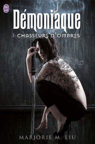


Caro: The Iron Hunt cover (Démoniaque) is the cover that caught my eyes on the website. What a gorgeous cover. I love it to pieces. I love the ‘colors’ I LURVE the tattoos and I even like the title. My only concern is that I keep thinking that the guy behind her must be looking at the “moon”. LOL But apart from the way too low pants I love it.
Night Shift by Lilith Saintcrow left me torn. I like the colors and the streetview but a belly showing woman is not really original. It’s a MEH cover for me. But oh well it could have been worse right?
What did Richelle Mead do to the French publishers to get this cover? That woman’s face look puffy and way too …weird. Nope I really don’t like it. I think it’s the angle that is wrong…I don’t know. MEH
Susi: The Iron Hunt cover really catches the eye as you said. It is pretty intriguing but now that I stared at it for a while it misses a certain something. Perhaps a bit more color. And Bwahahah about the moon comment- soo true.
And well I wasn’t aware that Jill Kismet is anorexic- that’s teh first thing I thought when seeing this one. Please some feed that girl. And I always imagined Jill to be more kick ass.
Wow, that Richelle Mead cover doesn’t look like the kick shaman Eugenie is. Her make up looks weird and well the woman in all looks like she’s trying to hard. Meh.


Caro: OMG why??? why? Why would they do that to J.F Lewis series?! It’s such a funny book. Yes it has some dark and gritty story but it’s such a fun book. When I see this cover I’d never imagine it was funny. Also I don’t think that man looks like the hero. Well neither does the woman. *sigh* Well it’s not a fugly cover just meh.
I love Lisa Hendrix’ cover! I love the colors really much. The wings are very nice too. And you can’t deny that that man is delicious. It’s a complete win for me. I would totally get this book if I saw it in a store *g*
I’m still not sure why, but Succubus Dreams has 2 french covers.As much as I like the early covers in the series this one is not doing it for me. I don’t know how but her wings are getting uglier by the cover. Also it looks a too much like Nalini Singh’s cover for Archangel’s Kiss. *sigh*
Susi: That is exactly my first though about the JF Lewis cover too- it doesn’t suggest hilarious book at all. It looks so serious- not what I think of when I remember this book.
You are right the Hendrix cover is really pretty even though the covers are a bit too tame for me. And well the guy looks like an angel with those wings and yes eagle shifter and all. but still if I wouldn’t know that I would say angel story from the cover.
And well the Succubus Dreams cover. Did we ever find out why she has wings on the french covers? Perhaps they added those to the story? That irks me so much. Seriously, what where they thinking to give her wings?? Stupid and so wrong.


Caro: I dare you to tell me the cover of Wings doesn’t rock! I find it so pretty!! Of course since I haven’t read the book i have no idea if it fits the story but I really like the cover. Ok so maybe the butterfly wings couldn’t have been done better but the rest is gorgeous. I love how her hair seems in movement and how pretty her lips are. ⇐ yes I’m jealous.
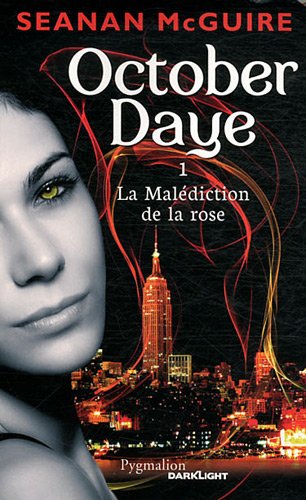
Ewwwww! I very much dislike (i’m trying not to say ‘Hate’) Seanan McGuire’s cover. It’s freaky and scary. Why would she be gray when all the rest is in color? Why the weird eyes? Is that normal? Why the weird eyebrows? Ok just too many Whys. Nuh-huh Me not like-y!
Ok so I know the cover of Sinful doesn’t match with the rest of the covers but I had to talk about it. I LOVED to pieces the US (original) cover of Sinful. What made it awesome was to see Matthew on the cover. Here it’s just a generic, bland historical cover. I’m very disappointed. Meh!!!
Susi: Okay I admit the Pike cover loos nice BUT it reminds me those pictures you learn to make in the various Photoshop tutorials. Seriously, it could be one of those. LOL So for me it’s not pretty unique.
I actually like the cotrast of the grey skin to the colorful background in the McGuire cover but I don’t like her face pretty much too. Can’t even say why but I think her eyebrows play a big role. LOL
I agree about the bland Featherstone cover. It really says nothing about the book. But I really like the title. Sounds naughty. *g*


Caro: I have no idea who is Cassandra O’Donnell but I kept seeing her covers and I had to post about them. I love that woman’s hair wow I wish I had those hair. Now the tattoo looks ridiculous. And believe me I’m not dissing the tattoo design because I have the exact same one on the wrist lol. No I just think it looks weird on this model but maybe it’s in the story. I really like that her lips are the same shade as her hair. Preeetty. Well now on to what I dislike? I find her eyes creepy. Also the blood looks weird. So yeah I kinda like it.
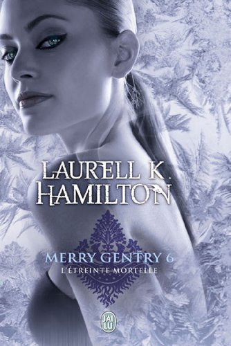
As much as I wanted to hate the Merry Gentry cover I just couldn’t. I am fascinated by her eyes. Wow I really love her eyes and the kinda haughty look. I even like how her ponytail seems perfect. My only complaint is how she’s dissolving in the wallpaper.
The Harper Connelly cover is a bit weird. Well to be honest I like it, I like her face and the arch of her eyebrow. But I also know it doesn’t really look like the heroine and I can’t help but think of getting her some chapstick. Well it could be worse.
Susi: The Cassandra O’Donnell cover looks sooo scary. The tattoo looks soooo photoshopped (well yours is pretty sweety- I swear) nd why is she cutting herself with that knife? And I’m sure that is a wig. LOL
I don’t like the Hamilton cover at all. It looks scary- the eyes are weird and again for my taste the model is too thin. And well that wallpaper blending thing is confusing.
Is it just me or does the cover model on the Harris cover look like Angelina Jolie? Perhaps it’s her eyebrows’ fault. LOL
Caro’s fave: Démoniaque
Caro’s least favorite: Richelle Mead’s cover
Susi’s favorite: no idea- okay Démoniaque too
Susi’s least favorite: the Cassandra O’Donnell one
What do you guys think about these new covers?
Any cover grabbing your attention? You know the drill… Which one is your favorite, which make you wanna puke?
Do you also want to know if the moon is full?


Share This Post
Subscribe and stay up-to-date


13 Comments
Join the Discussion
Previous Post
« ARC Review: Flawless by Carrie Lofty Next Post
Interview with Maggie Robinson + Giveaway »
« ARC Review: Flawless by Carrie Lofty Next Post
Interview with Maggie Robinson + Giveaway »
Our Sponsors

Our Giveaways


Unfortunately Google Friend Connect will stop working for non Blogger blogs at the start of March.
To stay up-to-date use one of the other options above to subscribe to the newest Book Lovers Inc. action.Thank you!


| 5 Stars: Perfect! I Love It! | |||||||||
| 4 Stars: Awesome Book! | |||||||||
| 3 Stars: I Liked It! | |||||||||
| 2 Stars: Not bad, but maybe not for me. | |||||||||
| 1 Star: Didn't like it! Did Not Finish it. | |||||||||


 Blog RSS Feed
 Follow Me on Twitter
 My Facebook
I think they're all a bit bland. Although the Iron Hunt cover is better than the US version. At least this girl isn't holding a sword in an impossible way.
@Sullivan LMAO Actually now that you pointed out the sword she IS holding it pretty weird. O_o wow didn't notice that at first.
I don't really like any of them, or is that because I prefer a hot guy on the cover?
I really like the wings one cos it is cute 😀
And the October Daye is boring and weird and they went crazy with the red
None of these is all that…But my favorite is the Hendrix cover and least favorite is the McGuire one. I don’t really care for the Demoniaque cover (sorry, gals) because I just don’t like tattoos. Would I read it? Sure. Look at it? Prefer not to.
The Harris and Hamilton covers do not resemble those characters at all. That’s a big no-no for me. Thanks for another fun post.
@Sully Yeah, I sometimes things cover artist try to invent new ways to not hold a sword. LOL It's a contest you know. 😉
@Aurian I so know what you mean. I would prefer mancandy to those too. LOL
@Blodeuedd Boring and weird says it all.
@LSUReader Well I agree- I usually don't like those tattoos either. I think those get their appeal from the reason why someone got it and those on covers always seems to be just too much and not like something anyone would really get.
Strangely enough, I like the Merry Gentry cover….and it's been years since I was able to find anything nice to say about Hamilton's work. That, in and of itself, is pretty amazing.
The Succubus Dreams cover is awful. The cartoon aesthetic screams YA to me. And – though I haven't read the series – I'm pretty sure this is not a YA book.
I just want to complain a little bit about the "Wings" cover. What's with the butterfly wings? In the book, what grows out of Laurel's back is a huge flower, not insect or any other type of wings. The US cover has two flower petals that may resemble wings, but they're not.
@draconismoi LOL well I agree about saying something nice. 😉 And well yes it's a bout Succubus- not sure if those stories would work in YA.
@Sheree She has a huge flower growing out of her back? O_o So I have to admit that this sounds weird without knowing what the book is about. Like flower power high weird. LOL And yes those wings aren't flowers at all.
I wasn't impressed with any but that could be because I'm tired tonight.
I don't like the Seanan McGuire cover either, but maybe that's because of my love for the US covers done by Chris McGrath. They're so beautiful and atmospheric – very hard to top.
@Aurian I also prefer Hot guys on my covers but there's nearly NEVER any hot guys on French covers. *sigh* It's pretty annoying let me tell you.
@Blodeuedd I can't agree more about the October Daye. O_O I pity the poor authors when they see their awful international covers :/
@LSUReader Ohh I like tattoos! *g* But usually they look fake on covers and this time they don't. So yay.
I knew it!! I knew they didn't look like the characters! I don't think french publishers really try that much lol This is sad. *sigh*
@Draconismoi I know right?! That cover makes me want to pick it up! But I won't…because it's a Hamilton book so nope. It's on my banned list
Def not YA btw, so yeah it doesn't suite the book :/
@Sheree I had NO idea about the flower on her back. Seems they got it wrong here,, damn. O_O The one they used looks like a big tramp stamp.
@Diane Well it could also be because they aren't exceptional. French covers shine by their dullness most of the time.
@LesleyIt might be why. I liked how dark the US covers were. Dark and yes mysterious. This one is just weird. :/
@Diane N it'S not. Just nothing there to be impressed with. 😉
@Lesley Yes I agree- her US covers are awesome.