Book Lovers Inc.
Romance Novel Reviews, Author Interviews, Commentary
The Good, the Bad and the Are-You-Kidding-Me?
Filed in Book Covers , The Geeky Lover , The HEA Lover Posted on January 31, 2011 @ 3:00 pm
16 comments

This week, we’re taking you to France! The country of love (Caroline says: *snort*), good food and wine- they should know what a good romance cover should look like! But take a look for yourself- here are some new French releases of books you probably know. Caroline spent hours on the French amazon and raided publishers sites to get you the Good and the Bad and yes also the Are-You-Kidding-Me. Let us know what you think about the French way to entice you to buy them- or not.


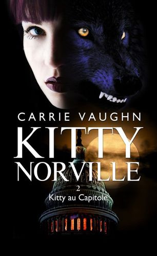
Susi: The Mary J. Davidson books looks as ridiculous as the original ones. I’m not much for these comic style covers but I have never read one of her books so I’m not at all sure if they fit her style. I like the violet bit WTF does she have on her head. Just silly. I think the Lyndsay Sands one is a HUGE cover fail. That is how they interpret the story in A Quick Bite? Where the heroine as a vampire can’t stand the sight of blood. So perhaps someone should have read more of the synopsis than vampire. LOL Biut on the other hand it looks fake so yeah- just bad no matter which way you put it. The Rachel Caine book looks not that bad. I think this stuff (stones perhaps) that flies around is a bit distracting. I’m not sure what that should tell me. And what does she have in her left hand? Is that a broom? No idea LOL Her jacket is great. The Kitty Norville cover looks like a wolf is growing out of her face O_o seriously disturbing. And why does she look so sad? and I’m not sure Kitty would wear that lipstick.
Caroline: I admit that I’ve never read the Queen Betsy books either, and it’s probably because of the ugly original covers. I’m right there with you with the comic style cover, I don’t like it much. But well if I had to choose, I like this version better than the original. BTW the thing on her head is her Hide-the-unicorn-in-you…lol i’m kidding, it’s probably their view of a crown LOL. Yes the Lynsay cover is a big fail, first wtf is up with her hair O_o it looks like a wig. The whole cover looks like a bad photophop. Then there is the blood, which like you mentioned is really inappropriate considering that the heroine HATES blood. *sigh*
I do like the Rachel Caine cover, a little bit more colors would have been nice though. And true enough the tornado looks like a broom in her hand LOL I’m not a fan of it but it’s not a big fail at least. =P
Well, at first when I saw the Kitty cover I thought WTF? O_o…but now the more I look at it the…wait no no matter how long I look at it it’s still a WTF cover. First, Kitty is blond. Second the wolf really looks like it’s coming out of her head. I like the other parts of the cover, it’s dark just like the book is. My main problem is the fact that it doesn’t look like Kitty. :/
Susi: That’s a tornado? LOL My broom idea is more funny though.
Caroline: Your imagination is as wild as mine lol.


Caroline: L’Amant Revélé (Lover Revealed) is Butch’s book. Is that supposed to be Butch? Huh? The whole series is made of ‘bland’ couples completely unrecognizable one from the other (exactly like the US covers used to be). It’s really a MEH cover for me. The woman looks….swollen, probably because of the colors.
Murmure d’outre-tombe is the first Connelly book, I didn’t like the original cover much but I LOVE this version. It’s pretty and simple. I love the light in her eyes. I would pick it up if I saw this in a bookstore.
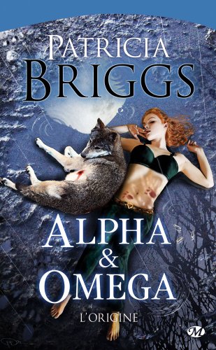
Alpha and Omega : The Origin …OMFG o_O WTF…when I found this cover I thought it was a fake. Sadly it’s not lol, it’s the real cover for the story that was in the anthology ‘On the Prowl’. First this wolf looks like a cute little cub. And the heroine is just O_o I have no words for this cover. I can only say… Booohoooooo! Go take a shower miss! lol
A Cran is the 3rd book in the Sarah Dearly series, could it be more bland? Meh Yes it’s a cute model but what else? What is there to see? ah yes a graveyard and a grey area at the top. I will just say MEH!
Susi: I always thought Marissa was blond? LOL And it looks way too nice and romantic for a BDB novel. MEH! It’s just too mushy and cute and not at all like the rather kick ass books. Doesn’t fit at all.
And I agree about the Harris cover: it is so pretty…I love how her eyes stand out and that means something if I like a blue cover. It’s just pretty- makes me wanna read it.
The poor Alpha & Omega cover: WTF is that? Seriously? Do they want to prevent people from buying this book. It was such a romantic and heartfelt story and they get a shot wolf on the cover. And I agree not even a grown up wolf- not sure if Charles would like that. Just WTF. And why does Anna have Mercy’s tattoos?
Poor Sarah on the Michelle Rowen cover. She was always so much wit and fun in the novels and she looks like the bitchiest and most unhappy woman on that cover. Not at all what I imagined her like.
Caroline’s :
Favorite: The Connelly cover
Worst: a tie between Alpha & Omega and the Lynsay Sand one.
Susi’s:
Favorite: The Conelly cover
Worst: Alpha & Omega cover
Do you agree with us about these covers? thoughts?
Which is your favorite and which is the worst in your opinion? Tell us why!
Is there a new foreign cover you would have loved to be the original? If so, which?


Share This Post
Subscribe and stay up-to-date


16 Comments
Join the Discussion
Previous Post
« Review: Snowballs In Hell by Eve Langlais Next Post
Interview: Author Courtney Milan + Giveaway »
« Review: Snowballs In Hell by Eve Langlais Next Post
Interview: Author Courtney Milan + Giveaway »
Our Sponsors

Our Giveaways


Unfortunately Google Friend Connect will stop working for non Blogger blogs at the start of March.
To stay up-to-date use one of the other options above to subscribe to the newest Book Lovers Inc. action.Thank you!


| 5 Stars: Perfect! I Love It! | |||||||||
| 4 Stars: Awesome Book! | |||||||||
| 3 Stars: I Liked It! | |||||||||
| 2 Stars: Not bad, but maybe not for me. | |||||||||
| 1 Star: Didn't like it! Did Not Finish it. | |||||||||


 Blog RSS Feed
 Follow Me on Twitter
 My Facebook
I really like the Harris one, simple yet beautiful.
The worst, the Kitty one felt messy but I will go with the Michelel Rowen one cos it tells me nothing
@Blodeuedd Yes that's the problem with the Rowen cover, it's very bland and unoriginal. o_O Mehhhh
@blodeuedd The Harris one is so pretty and yeah the other ones are just plain bad.
My Fave is the Harris one, I do kind of like Butch's book though you are right it does make it mushy.
Worse one for me is Lynsay Sands one
@BLHmistress Yeah the Butch cover is pretty just doesn't fit the book IMO.
I like the Davidson but I do not like what they did with the Briggs. Too bad.
Valerie
in Germany
This is a pretty anemic group. The two-faces-sharing-three-eyes cover (Kitty Norville) is particularly disturbing to me. The Harper Connelly cover is pretty, except—that’s absolutely not Harper. I don't like when covers clash with the book, like the Ward and Sands covers. The Davidson cover actually does match the Queen Betsy series, which was very humorous when it began. Last year’s Queen Betsy book—Ugh. Let’s don’t go there.
When did publishers decide that while novels are portable enough for international audiences, covers must be country specific? Maybe they should just come up with one excellent cover per book? Thanks for sharing, gals.
@BLHmistress Sadly all the French BDB cover are pretty much the same. *sigh*
@Valery The Briggs cover is even worse in high resolution. The woman is striking a 'seductive' pose that is pitiful. Even more considering that she's in the mud with a shot wolf pup. lol
@LSUReader I get why the covers have to be adapted. Different culture = different tastes. But that doesn't explain everything. I think the worst example is the erotica covers…in France on Erotica covers, you don't see naked/halfnaked bodies. o_O I'm always shocked to see the French Megan Hart books…you'd never guess it's erotica lol It's too bad really. :/
I haven't read the Harper books so I didn't know if it did fit the book or not.
Honestly, I am not crazy about any of them.
The Harris one is the best one of the lot although I don't mind cartoon-ish cover like Davidson's (I don't like Betsy much but that's another topic altogether).
None of them are that great, honestly, but the Lynsay Sands' one? Bad. Just bad.
I like the Harris cover.
On the JR Ward cover the chick looks like she's in desperate need of some lip balm.
I actually rather like the MJD cover. Betsy looks so very…stereotypically Frahhhnsh!! ^_^
The Rachel Caine isn't bad, either. But overall, this group of covers is not very exciting. IMO, They range from "Bad" to "Are You Kidding Me??"
…oh, and for those who've read some of the books, they're quite giggleworthy when compared to the content. ^___^ Fun fun.
@Mariya See why I order my books in english? lol Those aren't even the worst. No wonders French do not read much.
@Sheree The Harris covers for this series look pretty much all the same. But they are eye catching. And not fugly. So yeah I won't complain
@Chelsea B Yes the Lynsay Sands looks like a bad photophop job. I saw this series this morning at the store and the covers are even fuglier in real.
@Kaetrin LMAO now that you mentioned it I see that the poor girl is in need of lip balm LMAO I don't HATE this cover, it's just not as good as it should be. But oh well the originals weren't great either. *shrug*
@Alisha I agree that they aren't really good. In the next post we'll have new German Covers and seriously some are just gorgeous!! just wait and see =P
@Valerie What Caro said. That Briggs cover is really bad. Perhaps they didn't put much effort in it cuz it'S "only" a short one?
@LSUReader Yes I agree- it really looks freaky. I have no idea who Harper is so I'm not sure if it fits. And yes good question there. It seems the publishers disagree though but on the other hand we never all agree about a "pretty" cover so perhaps it's more the case then we think.
@Mariya Me neither.
@Sheree I never really warmed up to those comic like covers and the German publishers love those way too much for my taste.
@Chelsea Yep and yep.
@Kaetrin LMAO about the lipbalm!
@Alisha You mean the MJD one? I never read her.