Book Lovers Inc.
Romance Novel Reviews, Author Interviews, Commentary
The Good, the Bad and the Are-You-Kidding-Me?
Filed in Book Covers , The Geeky Lover , The HEA Lover Posted on August 29, 2011 @ 11:00 am
13 comments

Welcome to our new edition of The Good The Bad and the Are-you-Kidding-me? You must be wondering how we decide on which topic to make each of our post about…okay maybe you’re not wondering…it’s a real mystery to us too! Let’s take today for example…I’m not sure how we ended up deciding we should talk about Yellow Historical covers! It’s a miracle but hopefully entertaining enough. *wink*
On a side note I should mention Yellow is a favorite color of mine *g*
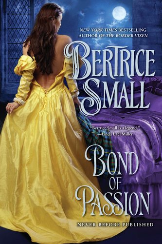


Susi: The first thing I always notice on historical romance covers is the swirly font. They usually all look the same and that really annoys me. I like the contrast of the yellow dress and the blue background on the Bond of Passion cover. Her dress seems to be rather unhandy though. Looks like it will fall down any second now. OMG I so adore the Courtney Milan cover. It’s soooo pretty and look at how her corset is laced in teh back. And the curtain in the front makes me feel like I’m snooping and caught them while they make out in some dark corner where no one can see them. Only thing I don’t like is the ugly huge ring the guy wears. Makes me stare it and distracts me me from the prettiness. Not good. LOL I really like the color of the Eileen Dreyer cover but her face is just too much. do we really have to talk about what that makes me think AGAIN. It doesn’t really look sexy. And surprisingly I like the font on that cover.
Caro: I have to agree with you about the swirly fonts all looking the same. But it’s a must-have on Historical covers 😉 I love Yellow! It’s so bright and shiny but the dress on Bond of Passion is a bit TOO bright. My main problem is that it doesn’t seem possible to have such a bright/light dress at night and with the moon as only light. Call me picky! lol It’s not a bad cover, just unrealistic *g*
*cough* Ok so I’m really too picky but I’m not falling for Courtey Milan’s cover…I’m not sure what’s bothering me. Maybe it’s the woman’s facial expression or the too smooth chess (of the man of course LOL). But the dress is bright and pretty *g* I don’t dislike the cover. I just don’t love it. =P
On the other hand, I really like Always a Temptress, I love how smooth and soft her skin looks and her dress is GORGEOUS! And the color of their skin…Love all that. It’s lush and sensual. NOM BUT because there’s a but…I really don’t like the expression on her face. It makes me want to roll my eyes. *sigh* Too cliched.And I think if the Author’s name was smaller we could see better the dress. =P


Susi: Okay it is probably just me but that model on the Candance Camp cover reminds me of Julia Roberts No idea why. I like the violet yellow combination- it looks nice and cute. But what’s that on the fan? Sorry, I know I’m too picky but I don’t get what that should be. Perhaps it’s the romance reader rorschach test? Next cover, next fan. Now I feel the urge to go and search for mine. LOL I really love Kieran’s covers. They always look like fun and wit and the title makes them seem so much cuter. And I like the font. Looks great on it. All thumbs up. The first thing I thought when I saw the The Leopard Prince cover is: why don’t they show us more of the Leopard Prince? We can hardly see his face and nearly nothing else. And what do we get instead? The mildly bored and unmoved woman. The front of her dress looks really weird so perhaps I shouldn’t judge her. I would look that happy with THAT dress too. So well. Cover is rather meh.
Caro: Bwahahah Susi, maybe it is! LOL I “think” that it’s a peacock but I’m not sure at all. LOL Now that you mention it, the cover model doesn’t look a bit like Julia Roberts!Ah! I like the model’s attitude. She looks like she’s up to no good! I love that little smirk on her face. Her dress is pretty and I find the showing garter pretty sexy *g* Again UP TO KNOW GOOD!!! *g*
I love Kieran Kramer’s cover. It’s fun and cute. I love the model’s face and her dress is gorgeous! Her fan is nice too. I like how the font sets it apart from the usual historical covers. It fits the book perfectly. Love it.
I too don’t like The Leopard Prince cover much. My problem comes from the face of the man…well that and his hair LOL. Meh! But I do like her dress and I love how her necklace is not centered. It’s a small detail but it gives the impression of movement. So I’d say it’s meh but not bad.


Caro: And Then He Kissed Her, ah that book is still waiting for me to read it on my shelves. I love and dislike it at the same time.I like the dress and I like the woman. But I dislike the male model’s face and the titles/author name/quotes looks like a big block. The font is too…too swirly. It’s a meh cover for me. It doesn’t stand out from the thousands of Historical romance covers out there.
Now Lisa Kleypas’ new cover is sooooo pretty. I love it. I love the dress which is just gorgeous and looks like pretty silk. I love the colors I love how the model is posing. It’s a very pretty cover. Nothing exceptional but it’s pretty. *g*
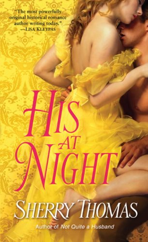
His at Night is one of my favorite cover out there. It’s made of win. I love how the dress matches the wallpaper. I love how she seems to melt into the background. The pose is sensual. The skin looks soft. 2 thumbs up!! I love it.
Susi: And Then He Kissed Her looks weird. Is it just that pic we found or is it always that blurry? It looks like it was left on the oven and it melted a bit. Or do they think that this will make it look like art? Because it’s not working at all. I also don’t like the color combination- the red in combination with the yellow/orange makes it look like mud. I really like the dress on the Kleypas cover- that really surprise me cuz I usually don’t like these at all. But for me the pose is too staged. And it doesn’t look comfy at all. And about His at Night– I adore this cover with all my heart. It is made of perfect. The colors are awesome, the dress is great and her skin really looks so awesome. God, that makes me jealous. And I love that his skintone is a bit darker. *g* I could stare at that one for hours.
Caro’s favorite: His at Night / and Kieran Kramer’s cover
Least favorite: Bond of Passion
Susi’s favorite: His at Night
Least favorite: And Then He Kissed Her
So what’s your favorite yellow historical romance cover? (Okay that might be a too complicated question LOL..) Or do you have a favorite yellow cover?
Do you have a favorite color when it comes to book covers?
Or more an aversion like Susi and her hate for blue covers?


Share This Post
Subscribe and stay up-to-date


13 Comments
Join the Discussion
Previous Post
« Review: Dangerous to Her, by Virna DePaul Next Post
New Releases: Aug. 29 – Sept. 4, 2011 »
« Review: Dangerous to Her, by Virna DePaul Next Post
New Releases: Aug. 29 – Sept. 4, 2011 »
Our Sponsors

Our Giveaways


Unfortunately Google Friend Connect will stop working for non Blogger blogs at the start of March.
To stay up-to-date use one of the other options above to subscribe to the newest Book Lovers Inc. action.Thank you!


| 5 Stars: Perfect! I Love It! | |||||||||
| 4 Stars: Awesome Book! | |||||||||
| 3 Stars: I Liked It! | |||||||||
| 2 Stars: Not bad, but maybe not for me. | |||||||||
| 1 Star: Didn't like it! Did Not Finish it. | |||||||||


 Blog RSS Feed
 Follow Me on Twitter
 My Facebook
Great post, and I also love the color yellow. For historicals, I don't pay that much attention to the covers though. But Bertrice Small and Lisa Kleypas are two of my favourite autobuy authors.
Lol, well yes yellow sure is pretty and I sure like the Thomas one.
And I like blue covers *eyes Susi*
@Aurian Well I usually never buy historicals but most of them make me roll my eyes. Just so clichée. *hides from Caro*
@Blodeuedd I adore that cover so much. And seriously I only know one good blue cover. But well. LOL
HIS AT NIGHT is a wonderful cover and I think it was the first yellow one that I noticed, in a good way. My favorite of the lot is ALWAYS A TEMPTRESS because my favorite, Paul Marron, is the male model (even though there's not enough of him).
No color preference I'm a read the blurb kinda person!
I don't pay much attention to the covers of books.
@Aurian *g* Yellow is so awesome. I've never read any Bertrice Small books. I'll look at what she wrote on Goodreads.
@Blodeuedd Bwahahah Yep poor Susi is not a blue person. I think if we'd tried making a blue post she'd have nothing positive to say 😉
And YAY I agree the Thomas cover is so pretty
@Susi <_< I saw this!!!!
@Sheree Ohhhh so it's Paul again? Wow didn't even realize it was him. lol I really like that cover *g*
@Diane I am a read the blurb kinda of person too! lol I looooooooooooove covers…but covers alone are not enough to make me buy a book 😉 But it doesn't mean I can't appreciate a good cover *g*
@Estella That's such an alien thought for me. I think I used to not care…looooong ago. But I find it so revealing about a book to look at the cover. =P
@Sheree Yes I agree. Love it and it does look a bit daring. So much love.
@Diane Well I do that too LOL 😉
@Estella God, now I feel shallow.
I just have to love that Candace Camp cover—all that wonderful purple and gold together!
I agree with so much of what you gals said: The Sherry Thomas cover is gorgeous. The Lisa Kleypas dress is beautiful. Keiran Kramer’s books have cute, sassy covers.
My least favorite here is the Laura Lee Guhrke. For the most part, this group of covers is pretty good. Thanks for a fun column.
I'm probably more drawn to covers that have a lot of my favorite colors – pinks-purples-blues, but I won't not read a book that is in less favorite covers. More people must like the golds & brown shades such it's very popular in fashion.
@LSUReader The Camdace Camp cover is really interesting. I think what I love the most is that the model looks wicked! It's bound to be funny and sexy *g*
@Di Not long ago I saw pictures of someone's bookcases and all the books were set by color. It was gorgeous. And now when I look at my books I'm tempted to try too LOL Of course it would be hard to find books easily =P <===random me
@LSUReader I agree the Camp cover and well it reminds me of funny movies. *g* Thanks hon.
@Di @pattepoilue OMG that would be great but it would also mean that the series aren't together in the shelf and I'm not sure if I could live with that LOL. <– OCD-Susi
I really don't like yellow covers, although I like Lisa Kleypas' cover, very unusual pose for the book's cover.