Book Lovers Inc.
Romance Novel Reviews, Author Interviews, Commentary
The Good, the Bad and the Are-You-Kidding-Me?
Filed in Book Covers , The Geeky Lover , The HEA Lover Posted on October 24, 2011 @ 2:00 pm
13 comments

Welcome to our new edition of The Good, The Bad and the Are-You-Kidding-Me?! I’m pretty sure that many of you uses GoodReads (if you don’t then you really should think about trying! *wink*). And what do you do there? You add upcoming books you really can’t wait to read, most of the time they don’t even have a cover yet. So when one day you realize by accident that it now HAS A COVER it gets pretty exciting!!! Well last week I stumbled upon a few of them and it was a great surprise *g*. So this week we will both show you the covers of books we can’t wait to read!


Susi: O_o well you all know I’m not much for historical romance and even less for the cheesy covers. I don’t like plaid and that kilt and dress match too much. you can’t see where who ends and the other one starts. And again same old font. MEH!!! The Jeffries cover is a bit better. The dress is nice but the contrast between dress and background isn’t prominent enough. Perhaps a more contrasting cover would work better. And meh font again! Meh meh meh!
I’m positively surprised by the new Molly Harper cover. It looks so much more daring than the other ones in this series. I love it and well his back is to die for.*g*
Finally I like a cover in that series- A Perfect Blood looks great. I love her pose and that earth touching looks mysterious. But well I have no idea what that series is about so I’m not a good judge. 😉
Caroline: LOL oh Susi I knew you’d dislike the cover of The Duke’s Perfect Wife! Teehee. Well I’ll admit that it’s an acquired taste. I didn’t like it much at first but it’s growing on me. I concede that the color of her dress should have clashed a bit more with the rest. Right now her dress, the kilt and the background are melting a bit. Also yeah the author’s name could have been a bit smaller O_o. Well it seems there’s a lot of things I would change if I could LOL because I also think the man doesn’t look much like Hart. Well…for me Hart is more…dark…more imposing. He should nearly look threatening.*shrug* Not a bad cover but it could have been better 😉
I LOVE the red and orange theme of A Lady Never Surrenders. Ok I admit it’s not the most original cover ever created but it’s pretty and it has colors I love so i’m sold *g*. LOL I don’t know why you hate these fonts so much…Me likes pretty swirly fonts *g*
YES!!! That’s what I thought when I saw the cover of the next book by Molly Harper. It’s indeed sexier than the previous covers in the series. I love it! And yes his back is yummy! I also really like her hair style. Yes it’s important! *g*
Woouhouuu I knew one day you’d like a cover from this series! LOL I really like the cover of A Perfect Blood (again at first I was dubious). It’s dark and mysterious. And there’s something really cool happening with her hand. Now I’m curious. A tiny detail I really like is how the author’s name looks like the title of a horror movie. Maybe that’s just me but me likes! She’s wearing leather but of well it can’t be worse than the previous outfits she had 😉


Susi: Well you all may have noticed in the past that we both adore Dan Dos Santos’ work. He has the talent to pinpoint on what make the books so special. I so can’t wait to read what lays behind the Alien Diplomacy cover. Pretty and just perfect. It looks like another action-packed read.
Well the Sacrificial Magic cover is pretty but I have some quarrels with it. First they always fuck up her tattoo. In the book it is described as a combination of runes and well what we see here is more a tribal than anything else. And well that girl doesn’t really look like Chess. After all she is a junkee and perhaps you should see that more. Okay yes I get that this wouldn’t prolly sell as many books as this one does but well it is deceiving to show her like that. It is pretty but wrong.
The Tangle of Need cover is so different. I’m not sure if I like it. It doesn’t really fit in with the other 10 covers, not that I liked those more but I have this strange OCD when it comes to my bookshelves and how I organize books and well. It’s prolly just me. And it does look a bit old fashioned. His face is weird. And just >.< I actually like the border but I would prefer it on another book. Yes I’m weird.
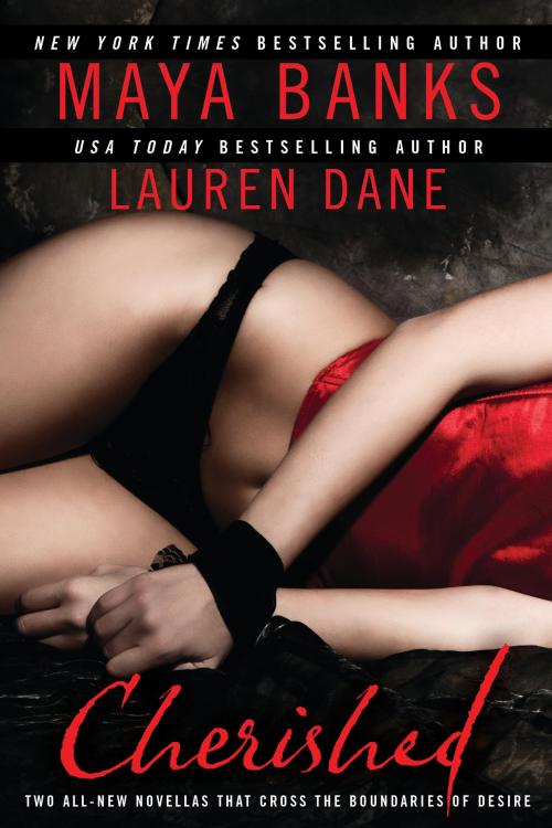
OMG I adore the Cherished cover. It looks so sensual it’s just wow. And look at that woman’s skin. Don’t we wish that photoshop would work in real life? I definitely would. I love the colors and the arrangement is just perfect. All thumbs up. Love it!
Caroline: I freaking LOVE the cover of Alien Diplomacy! The author is very lucky to get such fantastic covers for this series. It’s a complete win in my opinion. It screams action and sexy heroine with funny creatures. Well I just love it *g*
Sacrificial Magic is okay. It looks a bit somber than the last ones but it’s not there yet. And yeah I agree about the tattoos Susi. I don’t think they’ll ever get them right *sigh* It’s just okay.
O_O please someone tells me the cover of Tangle of Need is not the finished one O_O please. It’s so …fugly. Yes fugly is the word. His face looks weird. I think it’s because it’s been cropped and the angle of his face makes it just like his face is not right. O_o I can’t get over that fact. The title’s color is BLEH. And the weird border just doesn’t fit with any of the previous books. O_O 2 thumbs down. Me sad *sad caroline*
Cherished is sensual and pretty. I like it because it’s pretty simple. It’s not overdone and I like that the red of the title can be found in her top. The difference of colors between the background and her skin and the red make it interesting. I think it’s sexy and well done.
What do you think about these covers?
Are you also pining for any of these books?
Is there any upcoming book that has a cover that pleased or displeased you?
Anyone else thinks the cover on Tangle of Needs is an epic fail?
Feel free to tell us if you disagree with us *g*


Share This Post
Related Posts
Subscribe and stay up-to-date


13 Comments
Join the Discussion
Previous Post
« Guest Post by Mayra Calvani + Giveaway! Next Post
Guest Post: Author Henry Mosquera + Giveaway »
« Guest Post by Mayra Calvani + Giveaway! Next Post
Guest Post: Author Henry Mosquera + Giveaway »
Our Sponsors

Our Giveaways


Unfortunately Google Friend Connect will stop working for non Blogger blogs at the start of March.
To stay up-to-date use one of the other options above to subscribe to the newest Book Lovers Inc. action.Thank you!


| 5 Stars: Perfect! I Love It! | |||||||||
| 4 Stars: Awesome Book! | |||||||||
| 3 Stars: I Liked It! | |||||||||
| 2 Stars: Not bad, but maybe not for me. | |||||||||
| 1 Star: Didn't like it! Did Not Finish it. | |||||||||


 Blog RSS Feed
 Follow Me on Twitter
 My Facebook
I do like the ALien D cover, but…she looks anorectic there. And she has no thighs
@Blodeuedd Well yeah a bit thin but she's always been showed as skinny on the other covers. And don't forget a man made it *gasps* Oh yes I just said that! LOL Good think it's awesome on many levels 😉
I have to agree with you on the Kim Harrison cover. Probably the first time I've liked one of the covers in The Hollows series.
@Draconimoi It was bound to happen one day or another 😉 Now let's hope the book will be as good as the last *g*
All I can say is that Dan Dos Santos can do no wrong. His covers are always beautiful, even when they're strange and wacky. In the case of Alien Diplomacy, he's made it so that I'm asking, "What kind of crazy mess goes down now?!?" hehe….
I love the Alien Diplomacy cover!
And I'm waiting impatiently on both Alien Diplomacy and Sacrificial Magic.
@Blodeuedd Okay true but well it's made of awesomesauce otherwise.
@draconismoi Same here!
@Alisha Yes, I'm sooooo impatient to find out. *g*
@Sully *jumps up and down* Me too!
I am impatiently waiting for the Jennifer Ashley book, the Sabrina Jeffries book, and the Kim Harrison book. All three are great authors, and on my autobuy list.
I do like the colors, and the fonts.
I don't like the Gini cover, would not even pick it up in a store. I hate the Nalini Singh covers, and unlike you, I love the covers of the previous book, but not the new ones with those guys with scars/blood on their faces. Whoever invented those should be whipped.
@Alisha Exactly!! You can't help but wonder what the book will be about. I love that. I wonder if we'll ever get tired of his work =P
@Sullivan McPig I've yet to find something you didn't like the new Gini Koch cover *g* Ah wait…Aurian doesn't!!!
@Aurian Ohhh you don't like the new Singh with the heads of the guys? OMG!! LOL Yes I'm very in love with some of them. Yeah some looks stupid but some are so yummy. NOM NOM
But at least we agree of the stupid cover of Tangle of needs *sigh* :/
I like the Koch cover the best and the Singh the least. The Harrison one is pretty good in a series where the covers generally make me gasp, "What were they thinking?"
Thanks for a fun column.
Of course I like the cover of THE DUKE'S PERFECT WIFE – it's Paul Marron! LOL. I'm not too thrilled with A LADY NEVER SURRENDERS though. All the other covers in that series have a man (or part of one) on it. I don't particularly like the move to a woman in a dress by herself on a historical cover.
On the other hand, I'm, fine with a heroine by herself in UF/PNR like A PERFECT BLOOD. Nice one!
Even though I like Dos Santos' work, his cartoon-ish covers leave me cold (and I read manga); I like the ones he did for Mercy Thompson much, much better. Even though I have a couple of Gini Koch's books in my TBR pile, I have so far not touched them at all. Maybe I would like the covers more had I read the books.
I agree on the awesomeness of the CHERISHED cover. Wow.
I really like the cover for A Perfect Blood! Much better than Pale Demon.
@Aurian LMAO you don't like the Singh guys? Oh my, I'm actually thinking about buying those books again just to get the pretty covers aka the hot hunks LOL
@LSUReader Yep so true about the Harrison- first one I really like.
@Sheree I don't like when they change the theme on cover mid series. >.<
@Lesley It definitely is a winner.