Book Lovers Inc.
Romance Novel Reviews, Author Interviews, Commentary
The Good, the Bad and the Are-You-Kidding-Me?
Filed in Book Covers , The Geeky Lover , The HEA Lover Posted on November 7, 2011 @ 11:53 am
13 comments

Herzlich Willkommen everyone to this weeks edition of coversnark. We will venture into the deep and ugly sphere of German book covers. You will see the unbelievable today (not joking here) but we also got some nice ones in tow to soften the damage we will cause your eyes.
We advice to read on with caution- you will never be able to undo the damage. Keep in mind that no authors had a say in these covers and we should all offer our condolences for them.

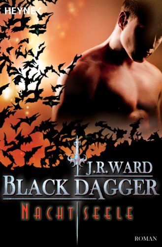
Caro: I’m not really sure why the publishers still think adding bats is a good idea. Yes we get it, these are vampire books O_o Sadly none of the Brothers can turn into bats. *sigh* The covers aren’t ‘Bad’ but I’m getting tired of the clichés. I do think they are ‘well made’, no bad photophop job or anything. The only problem is that they are very generic.
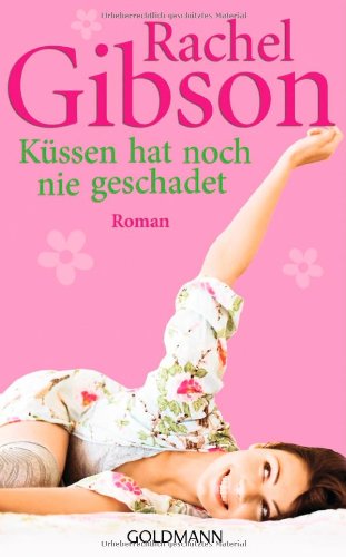
The Gibson cover makes me O_o it looks like a YA cover…and not even a good one. It’s bland and has no personality, I’d forget it in a second.
Susi: I have a huge problem with the German editions of the BDB novels. It is so many kinds of wrong to split a book in half too maximize your own profit. Seriously, how can they split a book in 2? But that’s a topic for another kind of post. The covers itself are meh too. As you said I don’t wanna see anymore bats and well the girl and guy look nothing like the characters. A total fail for me. The Gibson book is eye-boggeling. Okay, I haven’t read the book yet but it isn’t chic-lit, or am I wrong?It looks like one of those Bridget Jones books- something silly and cute. Me not likey.
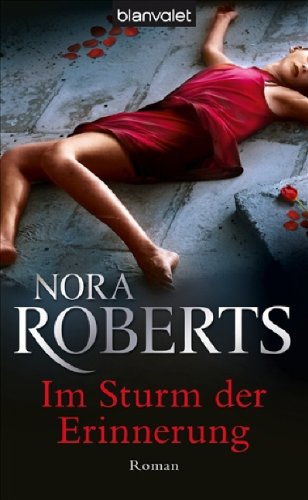

Caro: I really like the Nora Roberts cover. I have no idea if it fits the book or anything but I find it pretty and intriguing. The colors are warm and I like how the woman is placed. Now I’m unsure but at first glance I thought she was the victim of a crime scene LOL.
Poor Poor Kerrelyn Sparks…I’m sure no author deserves to repeatedly get ugly covers. Everything about this cover is offensive to the eyes…the colors, the bad photoshop job, the ugly ‘cut-from-a-magazine’ people. Bleeeeeeeeeergh. It sure doesn’t make me want to read it.
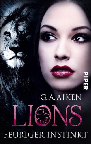
Oh the pretty Lions cover! Yes I know the woman’s face has been touched a lot, I mean it’s obvious but I still think it’s pretty. The cover is interesting and I love the lion in the O of the title. That title is what made it work for me. =)
Susi: I adore the Roberts cover on a visual level. I love how it tempts us to believe she is murdered at first and when you take a closer look she isn’t, or is she? This cover really makes you think. I have no idea if it fits the book though because I haven’t read Hot Rocks yet.
I have to say I really feel bad for Ms Sparks. Why do they always punish her with these bad covers here in Germany? No idea what she did but I’m sure she doesn’t deserve this. Again it looks as if the cover artist team did this one after their yearly Christmas office party and everyone was totally hung over. No idea how else that could have happened.
I love the cover of Lions- Feuriger Instinkt. The way her hair morphs into the lion and well as you said the O is just great. Really tempting cover. All thumbs up.
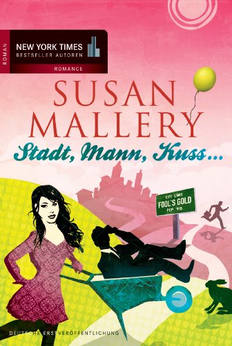

Caro: O_O Wow I would never be caught buying the Mallery book with that cover. o_O The original cover looked romantic and cute this one makes me think Chick-lit and not in the good way. It’s not pretty and it doesn’t make me want to read it. Why so much pink btw?
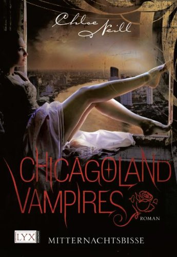
I think the Chloe Neill cover is pretty BUT it’s not right for this series. First she looks like she comes from a historical romance and it’s way too soft and …pretty to fit the book. On the other hand as a cover I do like it. I like the ‘old’ look and the title’s font. So…pretty but doesn’t fit.
I’m torn about the Kagawa cover. It both fits and doesn’t fit. =P I like it because it’s cute and the colors are fun and it gives the idea that it’s about the fae. But it’s a bit generic and it takes the easy road. If you look at most french YA covers they nearly all look like this one.
Susi: OMG the Chasing Perfect cover is more than bad. First the title: Stadt, Mann, Kuss is a really bad joke about a German game Stadt, Land, Fluss. Well kind of tacky in my eyes. And then we have the cover with it’s freakish colors that make my eyes bleed.
I really like the feel of the Chloe Neill cover. I love the colors and the mood. Also all covers in her series have the same vibe and I love when books in a series match. But well they don’t fit the books so meh as well.


Caro: So I am the only one who sees Liv Tyler on the Drake cover? Ok prolly only me lol. Well she doesn’t really make me thing of Mira O_o Yeah ok she has a ‘fierce’ look but that’s the only thing fitting the character. It looks like most of the German covers about UF from these last 3 years. O_o
OMG O_o WTF! What did they do to the Fools Rush In cover???? omg it’s horrid. Again PINK! And O_O . It’s just way too offensive. Again it makes me think of a silly chick-lit whereas Kristan’s books are so much more than silly. *sigh* And can it be any more obvious? Arghghhhh must look away now. >_<
*blink* *blink* *cricket chirping* Why would they make the Hollows Insider so ugly? Wow it’s O_O It’s just ugly….UGLY. o_O It doesn’t say ANYTHING about the book. Why would anyone pick it in the first place? *pets her own US copy of the book* *whispers* shhhhh Don’t worry my precious you don’t look like that!
Susi: Now that you say it she looks a bit like her but way fiercer. I like the idea behind the cover but the contrast between the violet and white is just too big. And does the book have anything to do with a firestarter? The Higgins cover is just WTF. LOL Oh my god it is O_o. Why are the guys on the wall? Seriously, does this tell us she can’t decide which guy to shoot and hang on her wall? And again too much pink. I think the people at Mira here have a thing for that color. LOL The cover of Blutwelten is scary and weird. The idea in itself is not that bad but well it doesn’t look appealing to me. Perhaps it would for horror fans but here I’m not sure if this will attract the eye of their targeted readers.
Caro: Yeah Mira can make fire so at least they got the title right!
Favorite:
Caro: The Nora Roberts and the Lions one
Susi : The Nora Roberts. So good! *g*
Least Favorite (aka OMG what were they thinking???):
Caro: The Kristan Higgins because I’m taking it personally! lol
Susi: The Kerrelyn Sparks- poor author needs a hug!
Alright now is your turn to tell us what you think of these covers?
Which one do you like and which do you hate? Are they all MEH in your opinion?
And do you have an idea how the creative process behind the German Sparks covers look like?
Tell us if you disagree with us (we love it!)


Share This Post
Related Posts
Subscribe and stay up-to-date


13 Comments
Join the Discussion
Previous Post
« Review: The Limit of Desire by Nico Rosso Next Post
Guestpost: Publishing Today – No Boundaries – All Options by M.J. Rose »
« Review: The Limit of Desire by Nico Rosso Next Post
Guestpost: Publishing Today – No Boundaries – All Options by M.J. Rose »
Our Sponsors

Our Giveaways


Unfortunately Google Friend Connect will stop working for non Blogger blogs at the start of March.
To stay up-to-date use one of the other options above to subscribe to the newest Book Lovers Inc. action.Thank you!


| 5 Stars: Perfect! I Love It! | |||||||||
| 4 Stars: Awesome Book! | |||||||||
| 3 Stars: I Liked It! | |||||||||
| 2 Stars: Not bad, but maybe not for me. | |||||||||
| 1 Star: Didn't like it! Did Not Finish it. | |||||||||


 Blog RSS Feed
 Follow Me on Twitter
 My Facebook
I think I hate them all. I tried translating the titles at first, and well they did not match up. The one I hate most is the Kerrelyn Sparks I believe. Does she even wear a skirt?
I am so happy with the pretty US covers. It's like the German publisher thinks all books females like are silly, so silly covers are needed.
@Aurian O_O I didn't even notice the no skirt on the Kerrelyn cover O_o
🙁 silly covers make me sad *sigh*
I really like the Neill one but because it does not fit at all. I would think it is something kind of historical.
Der Gute Lieght is so freaking ugly!!!!! OMG! Make it STOP!
And wtf, the split the DBD books in 2? Now that is just stupid, and been there. Here they always split fantasy books, in 2 or even 3. I hated publishers as a kid
I find the Harrison cover very compelling. I don't know if represents the book at all, but it really catches my attention. I would pick it up to read the back cover at a bookstore.
The two worst are the Higgins and Sparks covers. Unbelievably horrible!
That Higgins cover is just bad.
@Blodeuedd Ughh they do the same in France too with the fantasy books! There's like 4 or 5 books for EACH English book by George Martin for example. Makes series extremely expensive. And it's just SO stupid. I couldn't believe they would do the same with romance in Germany O_o
@Mary Beth Mary Beth yes they are horrid! It truly hurts my eyes to look at them.
@Mary it's just too sad to look at.
I agree that the Chloe Neill cover is pretty, but doesn't fit the book all that well
@Aurian LOL I think she has as short dress on but well had to see on that thing. Really bad.
@Bloedeuedd Yep make it stop indeed. LOL That just really made me laugh. Well they do that with the fantasy books here too. =(
@Mary Beth Unbelievable says it all.
@Mary Yep, her German covers make me sad.
@Lesley D Yep it it so compelling but German readers will probably be shocked by what the book is about.
I appreciate the efforts to “soften the damage” to our eyes. I’m not sure it worked, but still, you made the effort.
Poor Kerrilyn Sparks. She should contractually insist on blank covers for her European books. They are always awful! (Wait. Is this is trick? Is she trying to get featured frequently in The Good, The Bad, and The Are You Kidding Me?)
The Gibson, Mallery and Higgins covers look like someone dumped Pepto-Bismol on the artwork. So, so pink! The Nora Roberts cover is good. I know I read that book, but I can’t remember if this cover matches the content or not.
Suggestion—next time, could you add a line for us poor language–challenged folks, specifying the English title for each book? Thanks for another fun post.
Egad. It's a wonder German readers buy books at all.
@LSUReader Bwahahahhah, well could be. *snort* But the blank cover really would be an improvement. And oh yes, I forgot that you all can't read German. Will add those after uni. 😉
@Sherre LOL true. Well as you can see, I don't buy German books. =P
"Egad. It's a wonder German readers buy books at all."
Nope. I refuse to buy those books. Like Susi said, I don't buy GERMAN books either. (With minor exceptions here and there, though..)
It actually hurts to see this post.
@Patricia It is kind of sad. I only buy German books as presents for those who to don't read English aka my sister and mom. But every time I'm angry when I do.