Book Lovers Inc.
Romance Novel Reviews, Author Interviews, Commentary
The Good, the Bad and the Are-You-Kidding-Me?
 We are back with some pretty new, or better said new-to-Susi, covers. After being swallowed by real life I had the time to finally look around the publishing schedules for 2013 and found some pretty and not so pretty titles for the upcoming months. We have something for everyone- from pouting werewolves, over yellow flubber(not kidding), snarling lions, wings, critters (maybe) and rock’n’roll to Zombies.
Join the discussion and let us know what you think.
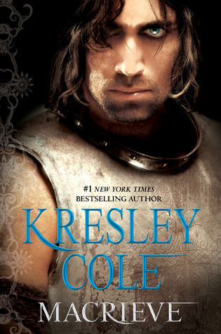


Caro: When I first looked at the Cole cover (30 minutes ago), I thought that the little shiny spot on his mouth was a big (ogre style) tooth! LOL Because let’s be honest he looks like one of those savages races you see on World Of Warcraft or the sort. lol. I don’t like it much, mostly because the hai looks weird. The eye looks way too fake too. I mean I get that she goal was to make the eye supernatural-like but in this case it just looks photoshopped. *shrug* I’m not impressed. Maybe that cover will grow on me. Who knows.
See, the Ilona Andrews cover, DID grow on me. I think it looks badass. My only complaint is the model chosen. But at least it matches all the new covers. I think she looks way too young and SOFT to be Kate. Where’s the fierce look?? But other than that I love it. The lion doesn’t look bored or stupid (see previous covers) and the whole thing with the flames give it an awesome twist. It looks like wings of fire. So yep it would be perfect with the right model, but it’s still really good.
Heart of Obsidian is a surprise. No man-boobs! No shirtless, headless shot! AH! I really like that we don’t see his face, he’s a mystery. A pretty badass one, walking under the rain while the city is ablaze. Pretty cool.
Susi: LMAO at the WoW comparison. I don’t like the MacRieve cover much. He looks shabby and the breastplate thing is dirty. And I want to tell him pouting isn’t his thing. Also on another note: it is wrong in my eyes to make readers install an app to be able to see the new cover in a series. Really kinda lame. And well I found it on goodreads so take that evil Cole promo team.
The Magic Rises cover isn’t bad at all- as you say she looks kick ass and well it is pretty BUT it is NOT Kate. i miss the old Kate. Not the big boobs one- the pretty one we had before. Oh I like the snarling lion though.
I’m so happy with Nalini’s new cover. Finally she got a great one- no fugly things going on. Mysterious and very intriguing. I approve.


Caro: Gena Showalter’s cover is what I’d like to call…boring. *gasp* Yes I said that. I mean it’s pretty to look at but it’s been done time and time before. It looks exactly like at least 10 other PNR covers. *shrug* I finally got bored of these covers I guess.
Blood Trade just doesn’t work for me. I loved the first few covers in the series but now it’s just the same cover over and over on a different angle/different color. I wish we had something different than Jane crouching with knives in her hands. Sad sad sad.
Humm so I gave up on the Elemental Assassin series a few books ago, mostly because I just started to hate the self-centered heroine. This cover…hum I’m torn. I just don’t like her face and how she looks like someone kicked her puppy. She should look fierce and sure of herself (god knows how many times she talk about herself and her skills in the books lol). I love the top of the dress but the strategically torn piece on the thigh looks like it’s been done to please male readers. *shrug* I do like the background though
Susi: I have to say I’m disappointed by the Showalter cover. The last one was pretty awesome and this one doesn’t look thought through. The wings in the back are kinda lame like that. The only thing I like is the shine of the girl’s skin but it makes the rest look even more bland.
I totally agree about Blood Trade– the pose reminds me of the last cover and well it is blueish. Meh, meh, meh. They definitely need a new idea for this series.
I haven’t read the Estep series so I have no idea what they are about besides something with spiders or critters (Susi’s awesome cover deducing skills). Her dress looks awfully slutty and it’s prolly not very handy in combat. I like the background. And well puppy kicking is bad people. LOL
Caro: No spiders or critters in these books, the Spider is just her assassin name.
Susi: That’s what you want me to believe. I’m not that easily fooled. *winks*
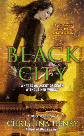

Caro: MEH! Black City doesn’t do anything for me. And that’s saying something because I’m usually partial to yellow! She looks like she’s doing one of my fitness workout. Squat! LMAO Nah, seriously, it has too much going on. I’m guessing this is supposed to be ash flying around, no? I really can’t tell because I haven’t read this series. Nope not working for me.
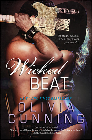
Now, Wicked Beat. OMG how I LOVE it. Love love love love!!! This is one of those crazy time when I don’t have words to describe how much I love it. It’s sexy and scream rock’n roll! I thought I couldn’t love a Sinner cover more than Hot Ticket but I do. This one looks less kinky but way more sensual. The colors are just perfect. *itching to stroke that cover*
White Trash Zombie is still disgusting but also still super interesting to look at. I’m not a zombie fan but even I have to admit she’s pretty kick-ass to look at. The hair, the look, the PANTIES! Very cool cover!
Susi: I agree about Black City. Why do those yellow sparkly things surround her? Or is it yellow flubber? Yellow water cuz we know what that would be. And the green clashes with the yellow- these colors make my eyes hurt a bit. The pose looks off somehow and just thinking about it makes my thighs hurt.
Well Wicked Beat is something. I love this cover. This hiding behind the guitar is pretty hot and well this cover just works. I seriously want to push that gal away and snuggle up to that dude.
Finally my favorite- The White Trash Zombie Apocalypse cover is by far my favorite. It’s just awesome. It rocks from the cig in her hands to the heart on her panties. A bit disgusting but also a lot of hot. Great Job!!! All thumbs (+2 extra bf thumbs) up.
Caro: MIIIIIIIIIIIIIIIIIIIIIIIIIIIIIIIIIIINE Eric is MINE!!!! Back off! *snarling is involved* lol
Susi: *steps back slowly*
Caro’s:
Yay: WICKED BEAT !!!!!!!!!!!!!!!!!!!!!!!!!!!!!!!!!!!!!!!!!!!!!!
Nay: Black City
Susi’s:
Yay: White Trash Zombie Apocalypse
Nay: Black City
Which one is your favorite?
What do you think is up with the yellow flubber stuff?
Any ideas for the Jane Yellowrock cover artists to make new and better covers?
Which one surprised you the most?
Share This Post
Related Posts


Subscribe and stay up-to-date


28 Comments
« Guest post by Ophelia London + Giveaway Next Post
ARC Review: Double Enchantment by Kathryne Kennedy »


Unfortunately Google Friend Connect will stop working for non Blogger blogs at the start of March.
To stay up-to-date use one of the other options above to subscribe to the newest Book Lovers Inc. action.Thank you!


| 5 Stars: Perfect! I Love It! | |||||||||
| 4 Stars: Awesome Book! | |||||||||
| 3 Stars: I Liked It! | |||||||||
| 2 Stars: Not bad, but maybe not for me. | |||||||||
| 1 Star: Didn't like it! Did Not Finish it. | |||||||||


 Blog RSS Feed
 Follow Me on Twitter
 My Facebook
I do like the new Kate cover. Before she was so white and now she at least look more like she should
I agree! NO MORE WHITEWASHING!
Though she does look like she’s about 17. Which is a little odd. Especially since books with actual YA protagonists often look about 10 years too old.
Wait, ladies, you think the old Kate looked whiter than this one? Wow I thought the exact contrary. I mean for me the old model did have some exotic traits. Not much some some. At least on the first few covers. This one looks very very Caucasian.
I hate it when covers are whitewashed but in this case it didn’t annoy me too much.
And yes my main problem is her very fresh, soft and innocent face. Not Kate! But well the cover is pretty cool so it balances it out nicely
Well yeah. I see an auburn-haired woman with gray-green eyes and pale skin and I think “white.”
I agree old Kate was more bad-ass than new Kate. But new Kate seems more likely to be mixed-race, like Kate is.
LOL as long as it’s still the same Kate in the book 😉
Well I like the Nalini Singh cover! The others …so-so
I’m really happy the Psy/changeling series is getting a great cover. I’m still hiding my US copies of the first books.
I hide my US copies of most UF books.
Caro I am with you on the Ilona Andrews cover, that model just doesn’t fit. Too young and soft. But the rest, love!
And Wicked Beat?!! AMAZING! Hot Ticket was so steamy I didn’t think they could make the next its equal…this one is as close as you can possibly get without climbing on top! Oh, wait that sounded a little dirty. 🙂
LOL I totally agree. I didn’t like the cover for Double Time much but this one and Hot Ticket?? Hot damn! I’m really excited to have it in my hands
My favorit is Heart of Obsidian. When I see that cover I like “finally, the series get what it deserve” and “Benedict Cumberbatch!!!”. LOL 😛
I also don’t like with how Cole reveal her cover with piece by piece. Since the model is not Paul Marron, I will wait the paperback 🙂
Wicked Beat also my favorite too! :D. Even when first I see it, why Eric bring guitar and not his drumstick, since he’s the drummer? But it one of sexy cover. Bring the sexy cover back! Banish all Fifty Shade-ish coverlike (okay, I’m just kidding)
I can’t get enough of looking at Wicked Beat. One of the hottest 2013 covers so far for me. And thank god we’re getting past the stupid 50 shades types of covers!
White Trash Zombie Apocalypse!!!!
I have to have that book kust for the cover!
I admit the covers the covers alone are tempting me to try this Zombie series!.
i think kate looks too young yes but ina whole i like the cover
I was surprise and disappointed when ‘fans’ started trashing the new Kate cover when it was first revealed. They were SO mean. I mean even though the model is not Kate it’s not a bad cover at all.
Favorite – Wicked Beat with runner up Heart of Obsidian
Hate – White Trash Zombie (sorry but I hate that whole look) with runner up Black City
Not a Zombie fan? lol I’m not either btw.
Wicked Beat FTW!!! *g*
I LOVE zombie covers. But not those ones. Those ones skeeve me out a bit.
Ewww zombies. Sorry lol I think the Walking Dead ruined Zombies for me forever. *shudders*
What I am hearing is that you do not intend to vote in my upcoming Series Smackdown: Which Zombie Apocalypse Kicks The Most Ass?
@draconismoi (it won’t let me reply to your last comment!) Oh my, I’m not sure I would be of any help lol I have never read a book with a Zombie hero. I don’t see the appeal of decaying flesh LOL
What, no Paul Marron? Then I’m not interested. ;P
It’s a rare occasion when Paul Marron doesn’t appear at least once in our post
Here’s my 95 cents–just to show how contrary I can be.
I liked the Cole cover–the grungy, not pretty part appealed to me.
The Andrews cover–just ugh. The model’s young and pretty and so very NOT Kate. Really hate her for this series. The new Curran is 100x better, tho. Those were some dopey-looking lions they dug up for the earlier covers. New Curran is rawr.
The Showalter cover looks very dated, like the cover of an 80s category romance. They took away the blue eye-shadow on the model and added some wing art, but otherwise very bland and old-fashioned.
Now, me? I love the Hunter covers. The model looks like Jane should look. I don’t mind the sameness because they’re done well and represent the series/character.
The Rowland covers are so disgusting and disturbing, but strangely mesmerizing. I own the first books in the series, but haven’t been able to bring myself to start them. Totally chicken.
I’d never buy the Cunning book based on that cover. Just doesn’t do a thing for me. I know, I know–something must be wrong with me since you all disagree.
The Estep cover, like all the ones for this series, is just meh. I need to see some improvement, forward movement in the storylines, too. Where is this thing going?
As I said below to LSUReader, I do love when someone disagree with me/us. *g*
As for the Cole, I don’t mind that hes not ‘pretty’, what I complain about is the ‘bad’ photoshopping. I can’t get past it, it’s all I see. *shrug*
See, we seems to agree about the Kate Daniels, Improved Lion, a model that is not Kate… Thing is we never had ONE model who looked like Kate. For as long as I remember, everyone has been complaining about the models. Now that we get a younger softer one, we realize the old one wasn’t THAT bad 😉
I agree that model looks like Jane, that at least it a good thing. Well it’s actually the reason I kept saying how much I loved the first few covers. But they could keep that model and try to do something else with the cover. They are just too alike in my opinion.
I won’t throw you rocks, I’m a chicken too when it comes to reading about Zombies! lol
Do you read Erotic romances? or Erotica? Because it might be one of the reasons. I’m sure the Cunning cover is not to everyone’s liking. I do love it because I already know the hero from the previous books. I think I also love this cover, not just because I find it sexy as hell but also because it’s well done. The Sinners all have a different kink, and Eric is a voyeur, he has been watching them all having sex for years. So now, I think this cover is pretty funny since we can’t SEE him kissing that woman. <== As you can see I'm easily pleased 😉 You know it made me smile this morning when I saw all the 'contradictory' comments. *g* I LOVE it when we disagree!!
Ok, in defense of Gin Blanco and Jennifer Estep’s Elemental Assassin series…usually Gin’s attire runs more to black slacks and dark tank tops. In the newest book, she will be attending a “high-society gala” where things go horribly wrong, so I suspect the torn dress is a reflection of that. Really, Susi, you haven’t read this series? It’s one of my favorites in the PNR/UF sub-genres. And Caro, you who adore Kim Harrison’s Rachel Morgan, are complaining about a self-centered heroine? Pot, meet kettle!
As for the strategic placement of the dress tear, I agree. Why, then, do you gals love the gratuitous ass shot on the Olivia Cunning book? Oh well, to each her own. I like the Nalini Singh cover best.
Oh no you didn’t!!!! *gasp* Rachel is nothiiiiiiiiing like Gin! omg thank god for that. I probably didn’t choose the right words in the post. Yes Rachel is a bit self-centered, but she doesn’t think herself the best thing in the world. Gin, on the other hand… GAHHHHH I should have counted the number of times she had internal monologues about how awesome and skilled and talented and the best at what she does. I get it, she’s confident in her skills but it was soooooooo many times after a few books I just couldn’t bear it anymore. Also I got fed up of the hundreds of references to ‘my blue eyes on his green’, ‘my eyes flashed blue to his green’ blablabla I don’t know about you but I NEVER think about the color of my eyes when looking at someone. And here it was ALL THE TIME. LOL Don’t mind me, I think series was ruined because I listened to the audiobooks. In addition to all these pet peeves of mine, the narration of the audiobook was very slow, so it was a slow torture.
As to why I love the Cunning cover with the gratuitous ass shot? Easy, THIS is erotic romance. I expect to see people half-dressed on the cover. UF covers are a whole different matter. She’s a kick-ass assassin, we don’t need to see her half-dressed!
lol
You know I really love when we disagree on covers/books *g* Makes it more fun!